Xpress Funding
Brand Redesign
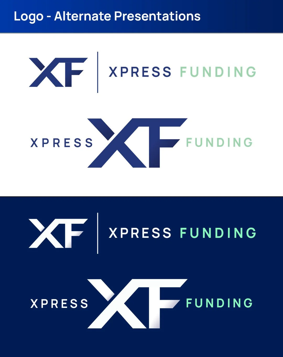
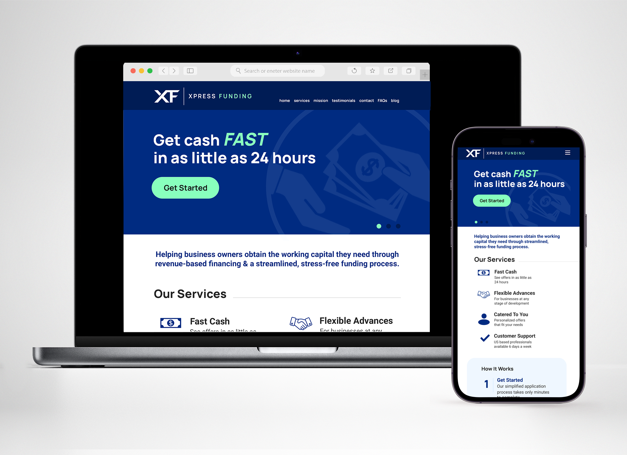
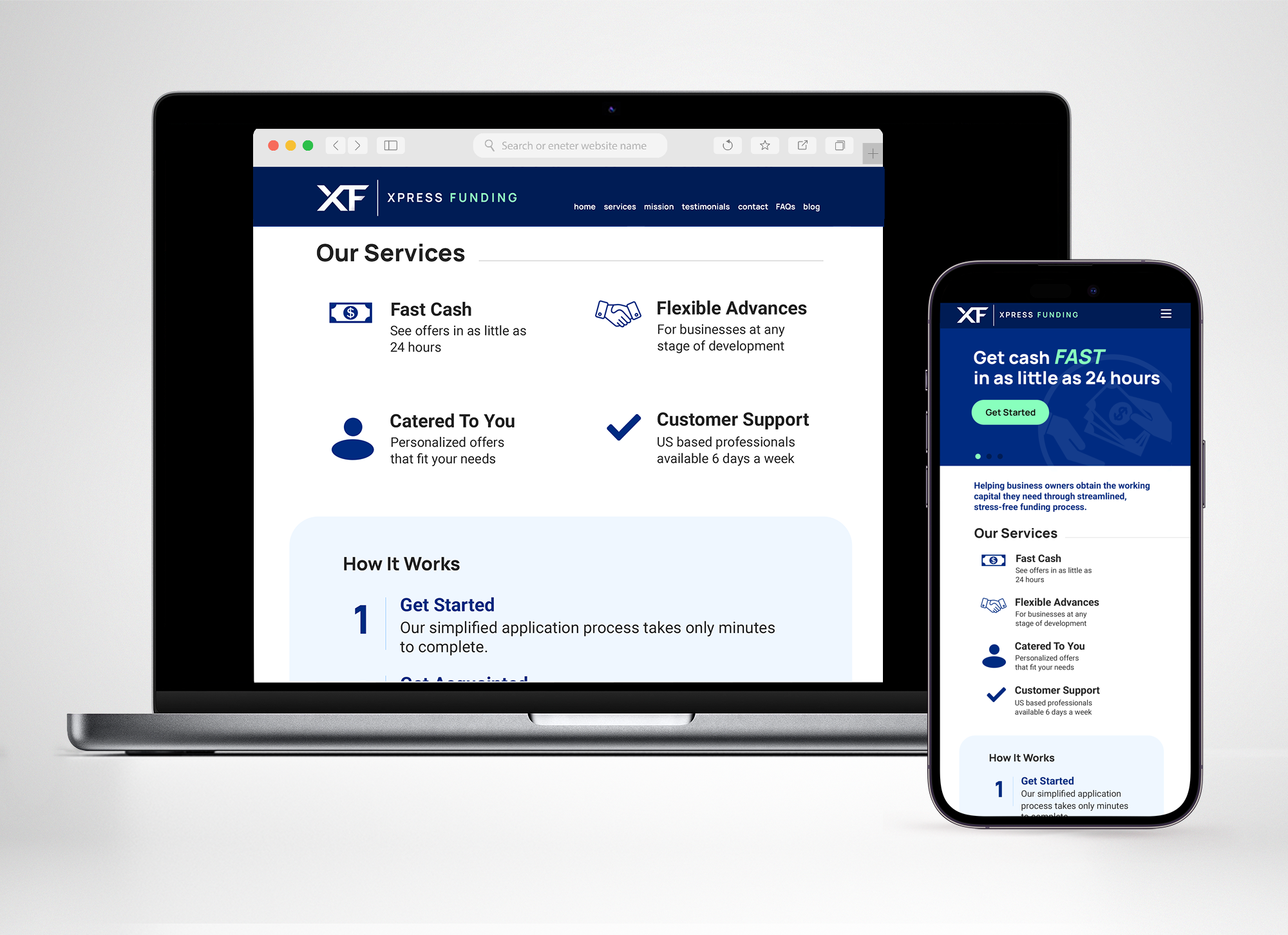
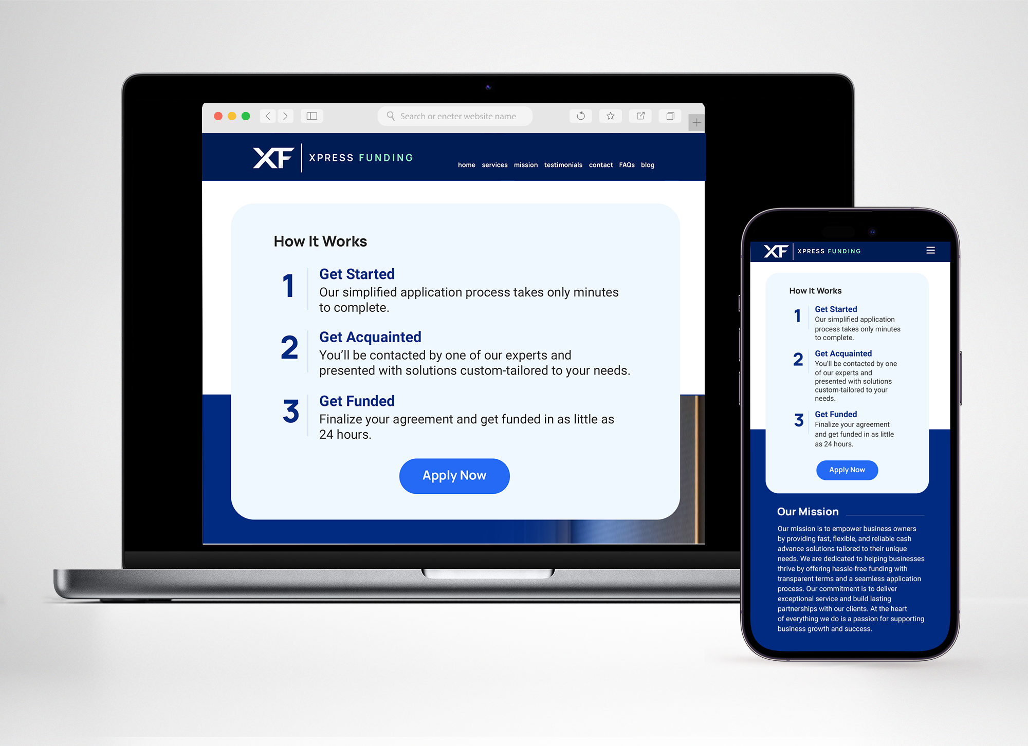
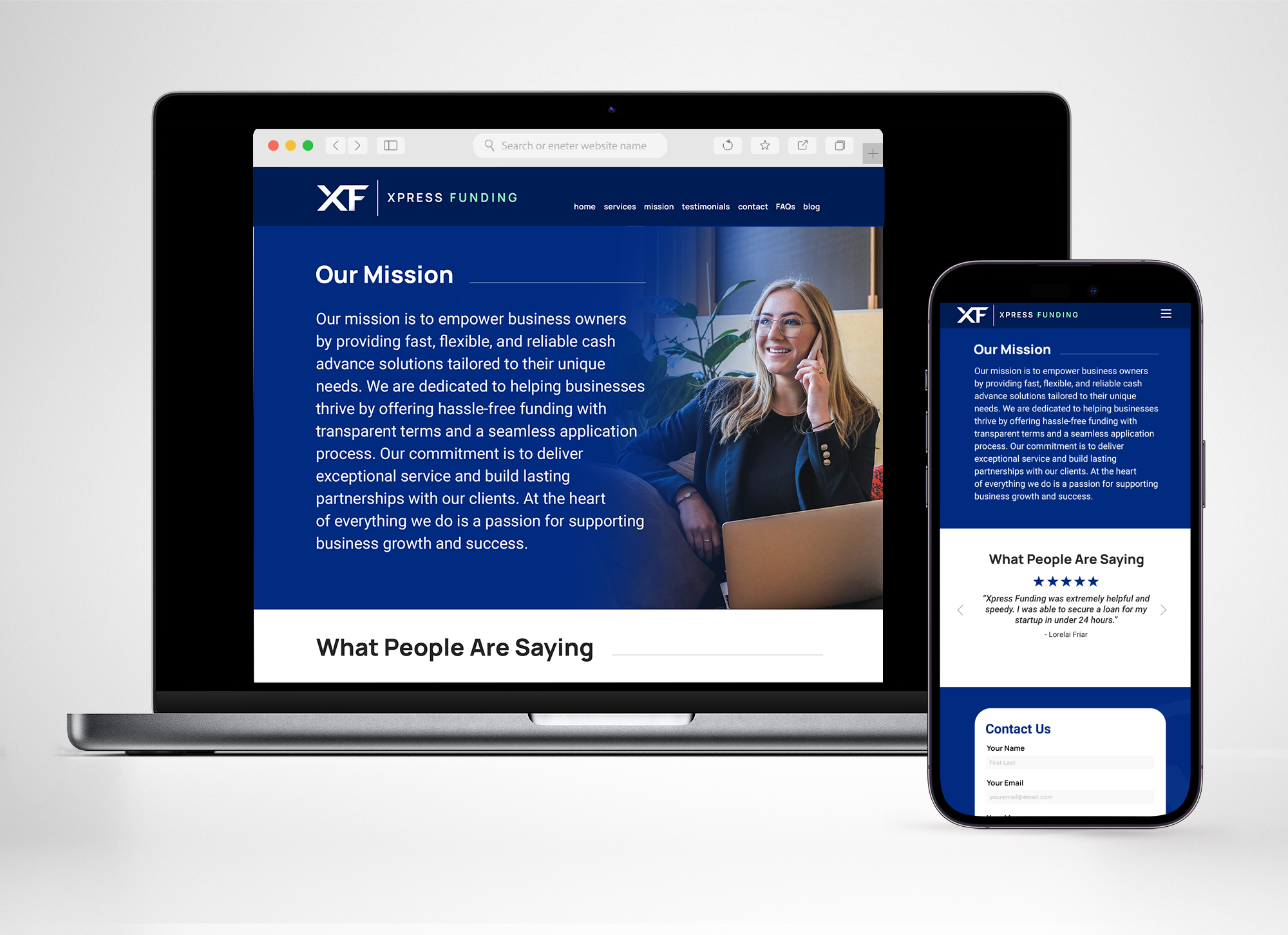
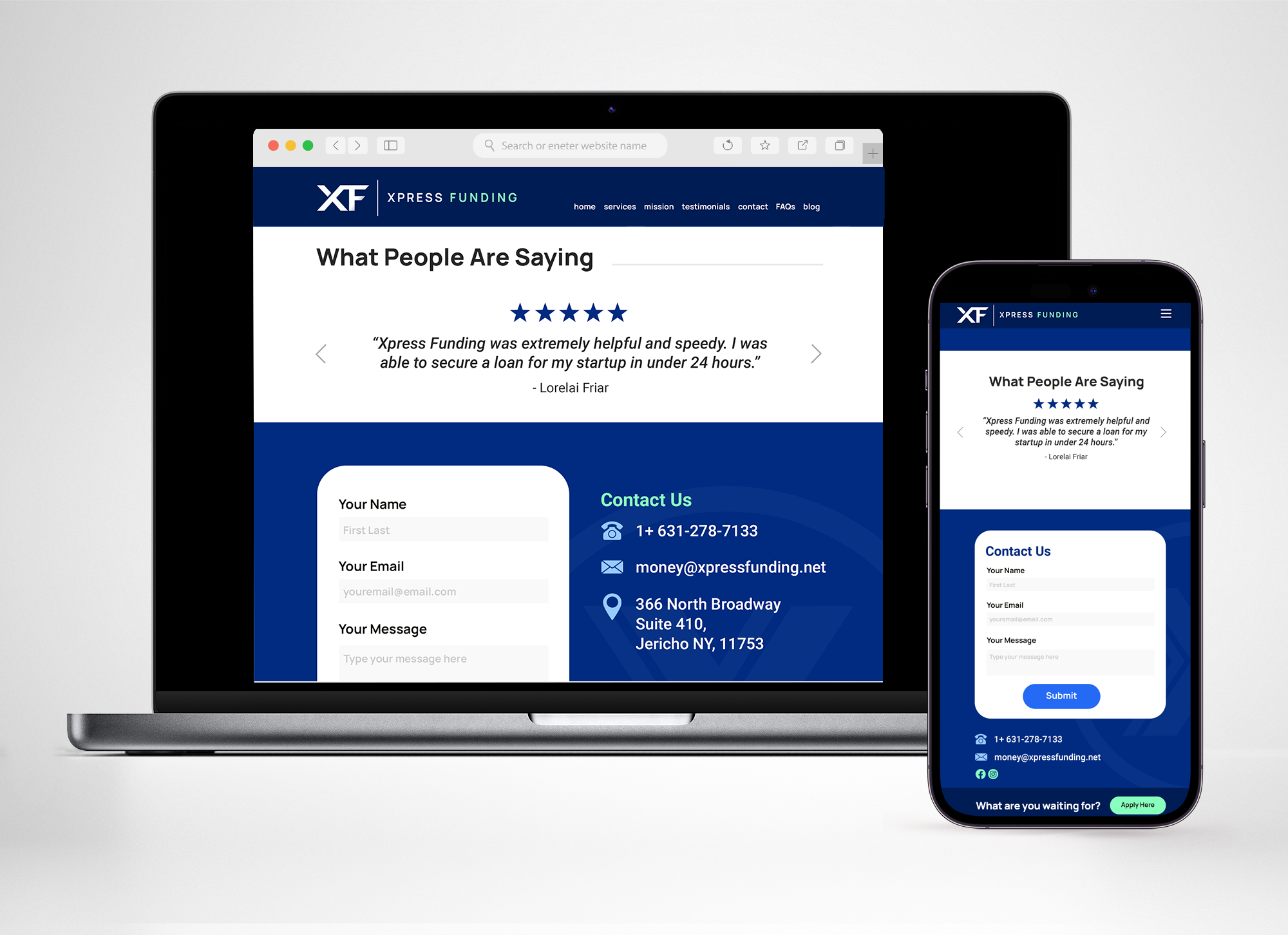
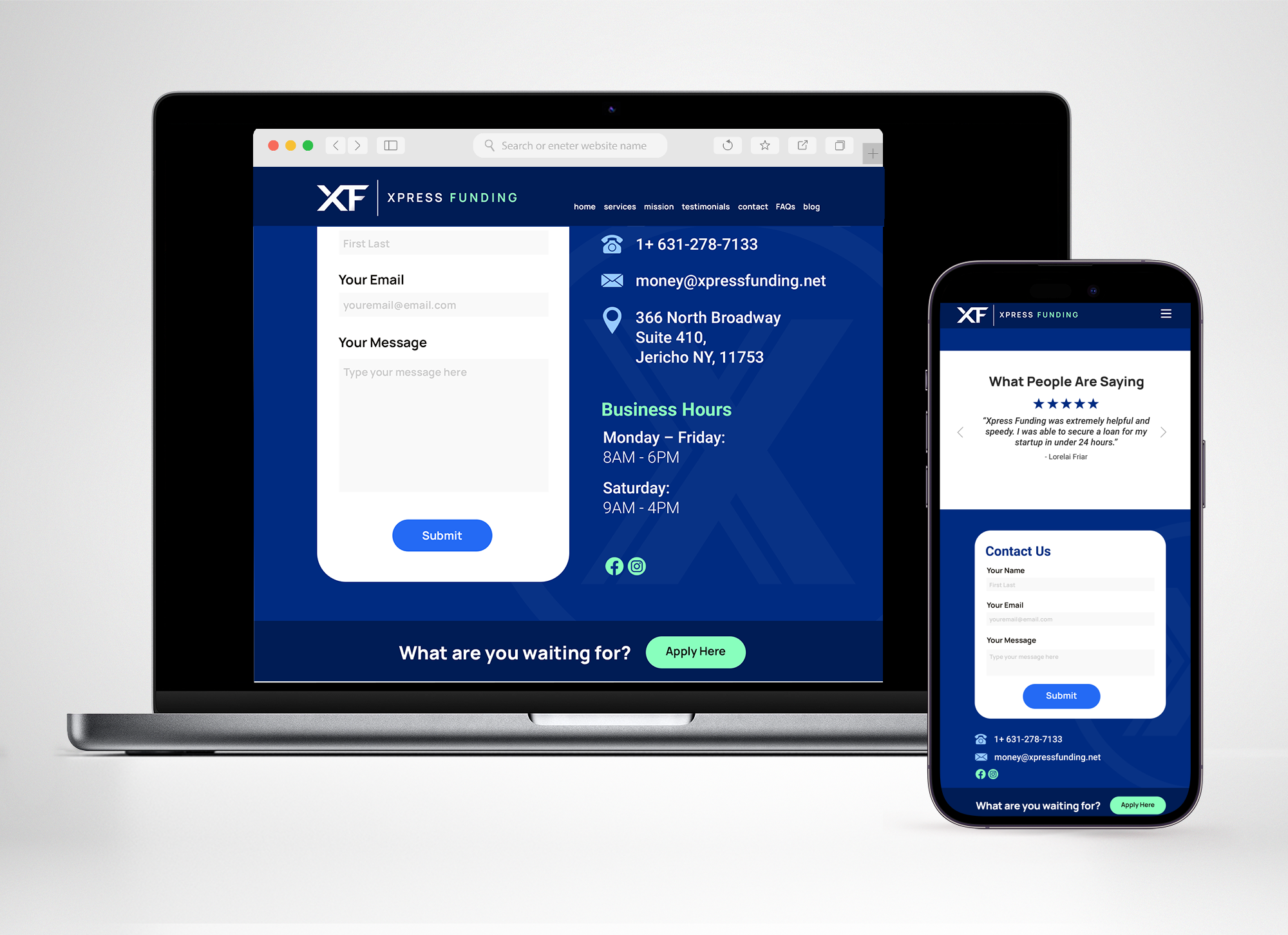
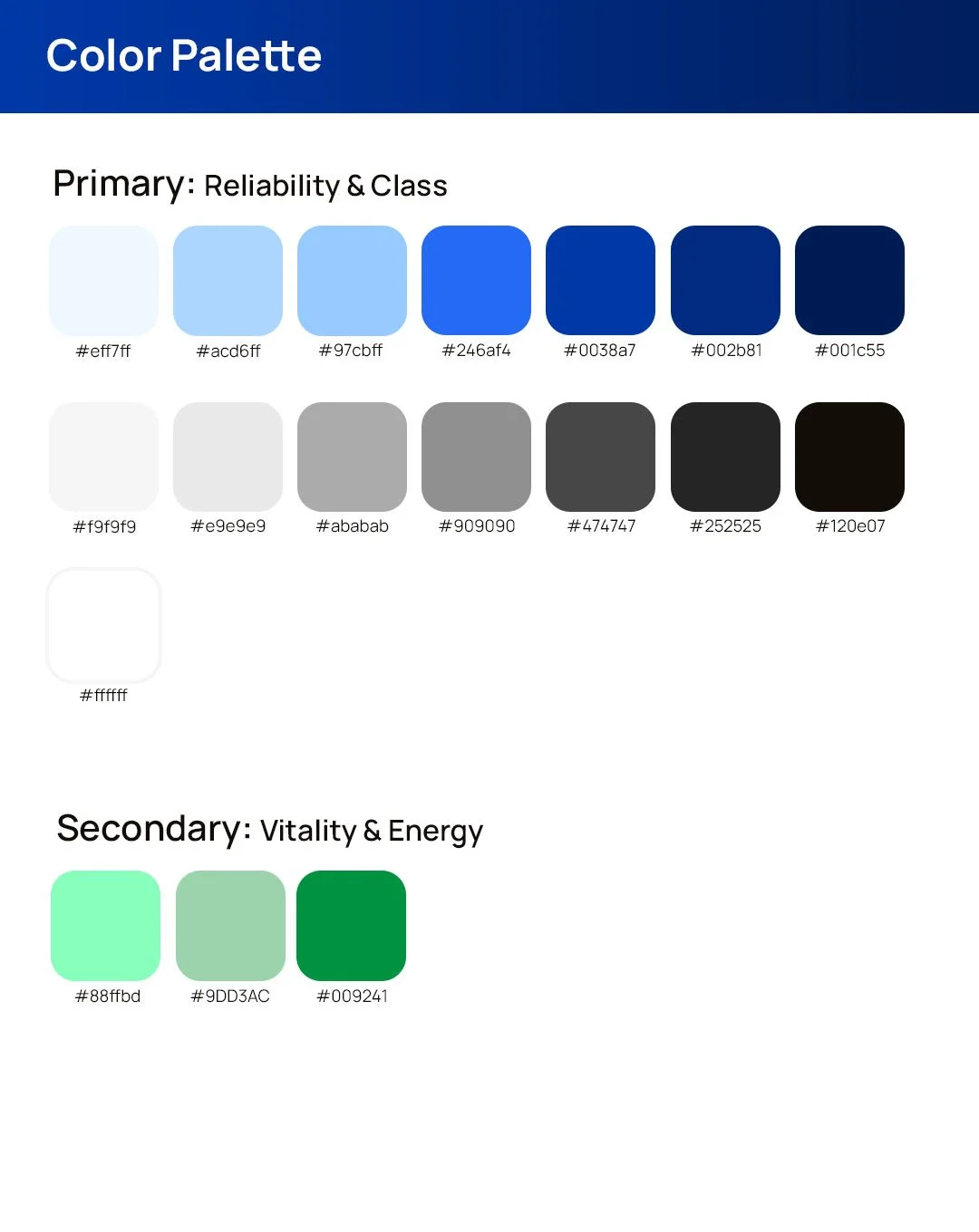
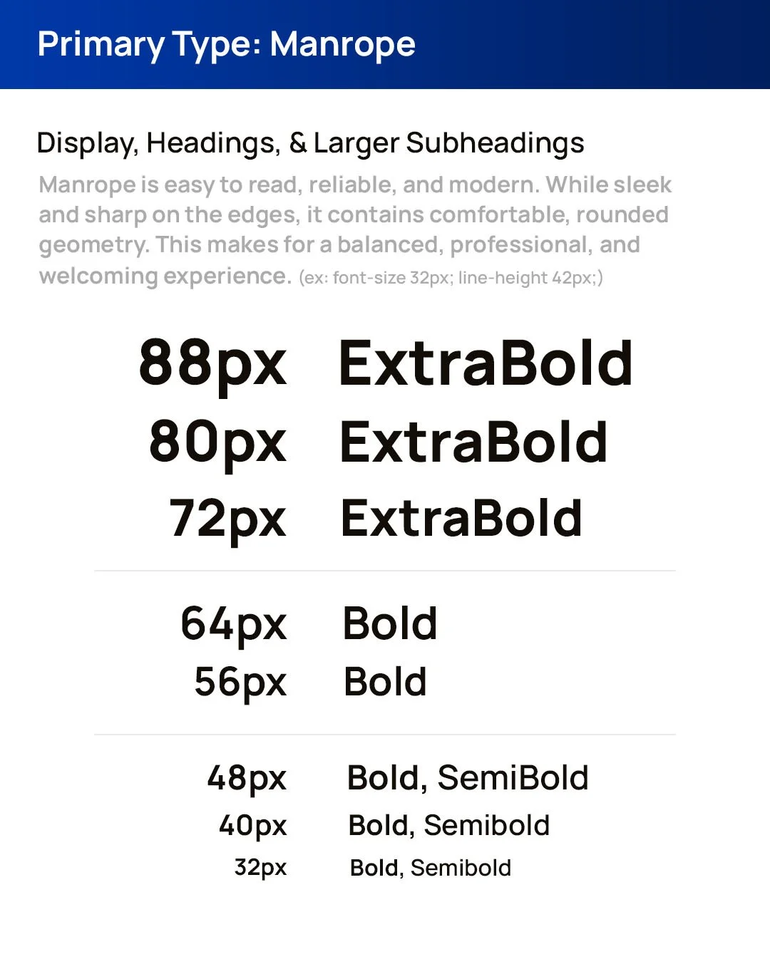
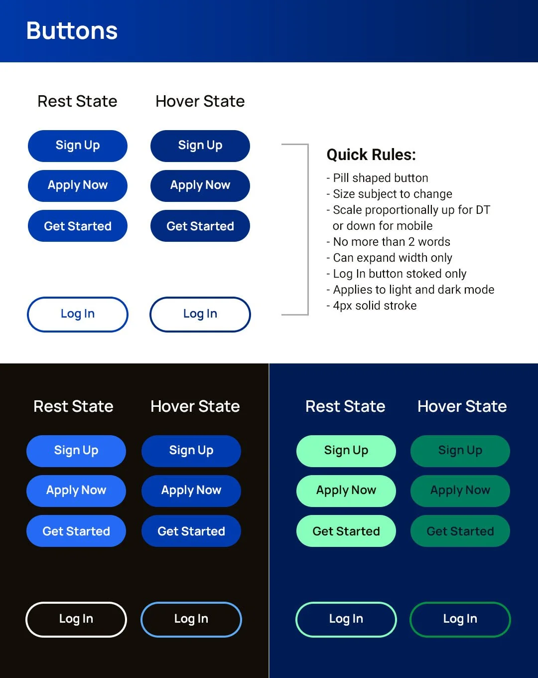
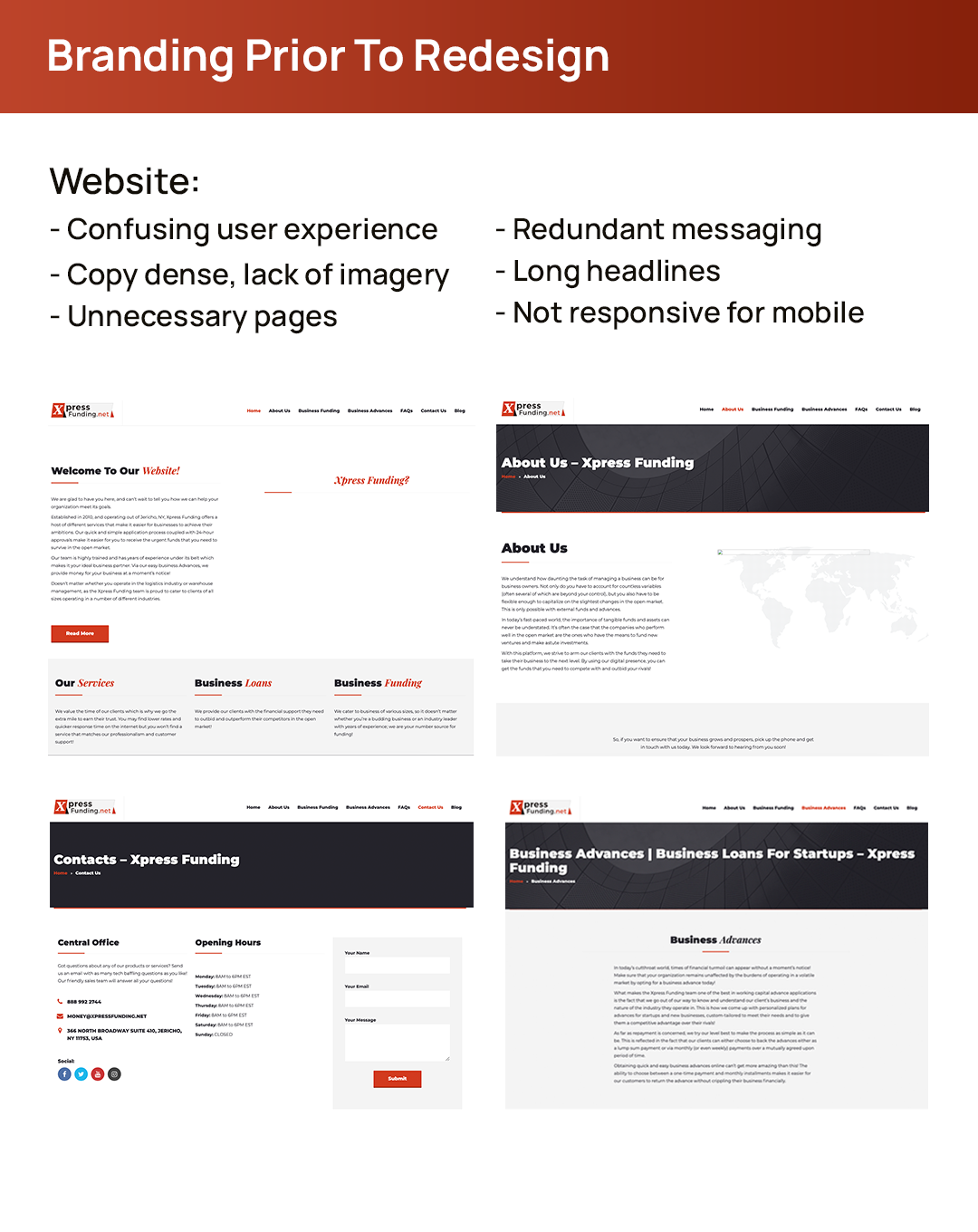
I collaborated closely with the founders of this startup to develop a redesign strategy that reflected their mission and values. The “XF” icon uses negative space and italic techniques to suggest motion and speed, reinforcing the company’s goal of delivering funds quickly and efficiently. The color palette combines blue — symbolizing trust and reliability — with neon green, representing the energy and vitality clients gain when they receive funding to pursue their financial goals. The website was designed to be clean, modern, and approachable, breaking down the cash-advance process into the simplest possible terms. With bold headers, intuitive iconography, and concise messaging, even first-time users can navigate the service with confidence and ease.