Case Studies
Joseph, Hollander & Craft - Logo Options
As a part of a design test, I was asked to refresh branding assets for a law firm named Joseph, Hollander & Craft. They are a family-founded law firm based out of Wichita, Kansas and have experience in civil, family, and criminal law. As they cover a wide range of areas, it was important to keep in mind the need for an all encompassing icon or typographic lockup to ensure they’re identifiable, but not type-cast among this industry. Paying tribute to their founding location, and home-grown roots, elements from the Wichita flag have been leveraged in subtle ways to help personalize this brand’s identity in both logo options.
Original Logo (prior to the redesign) is available on their home page for comparison purposes: https://josephhollander.com/
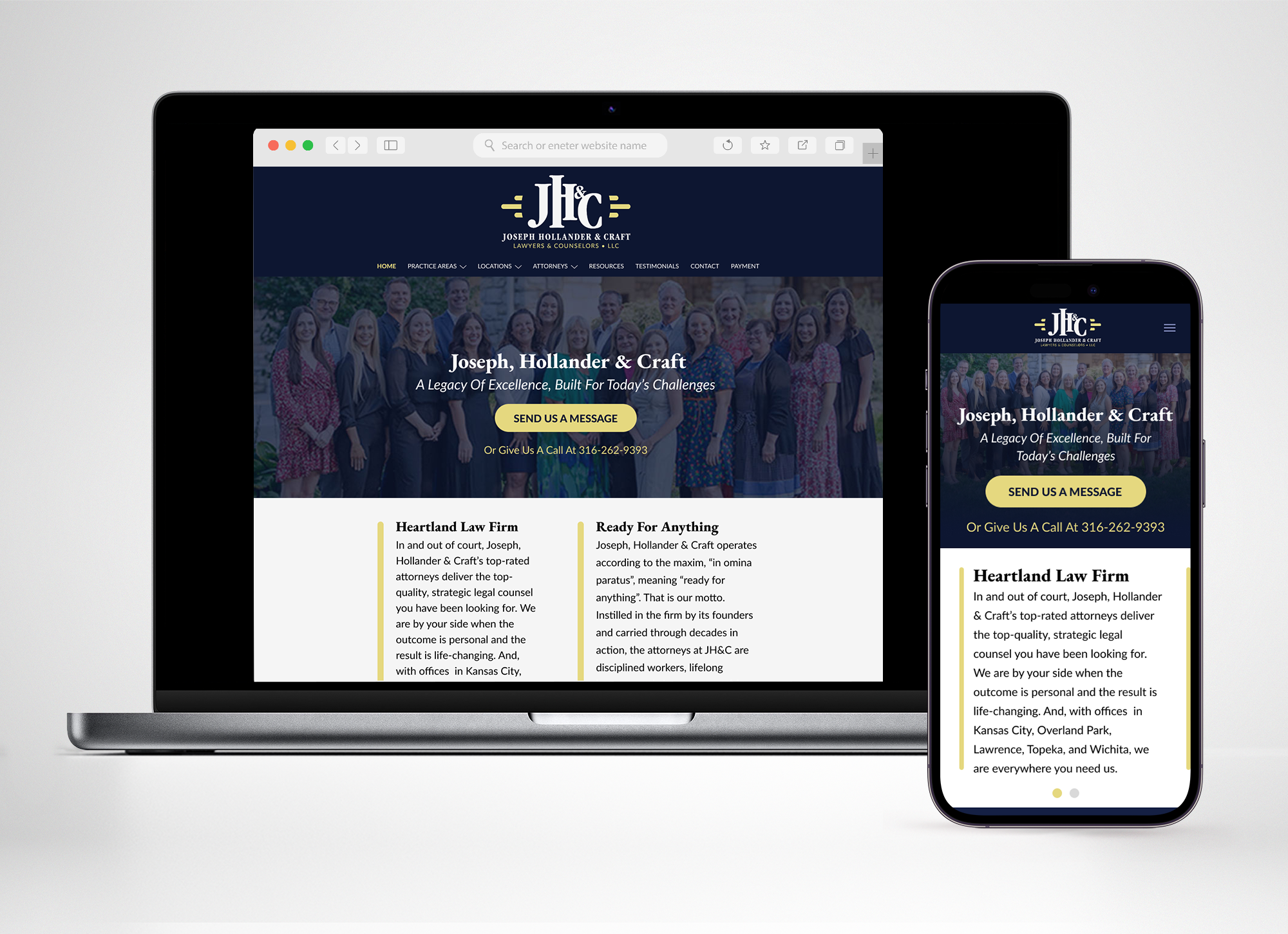
Joseph, Hollander & Craft - Landing Page
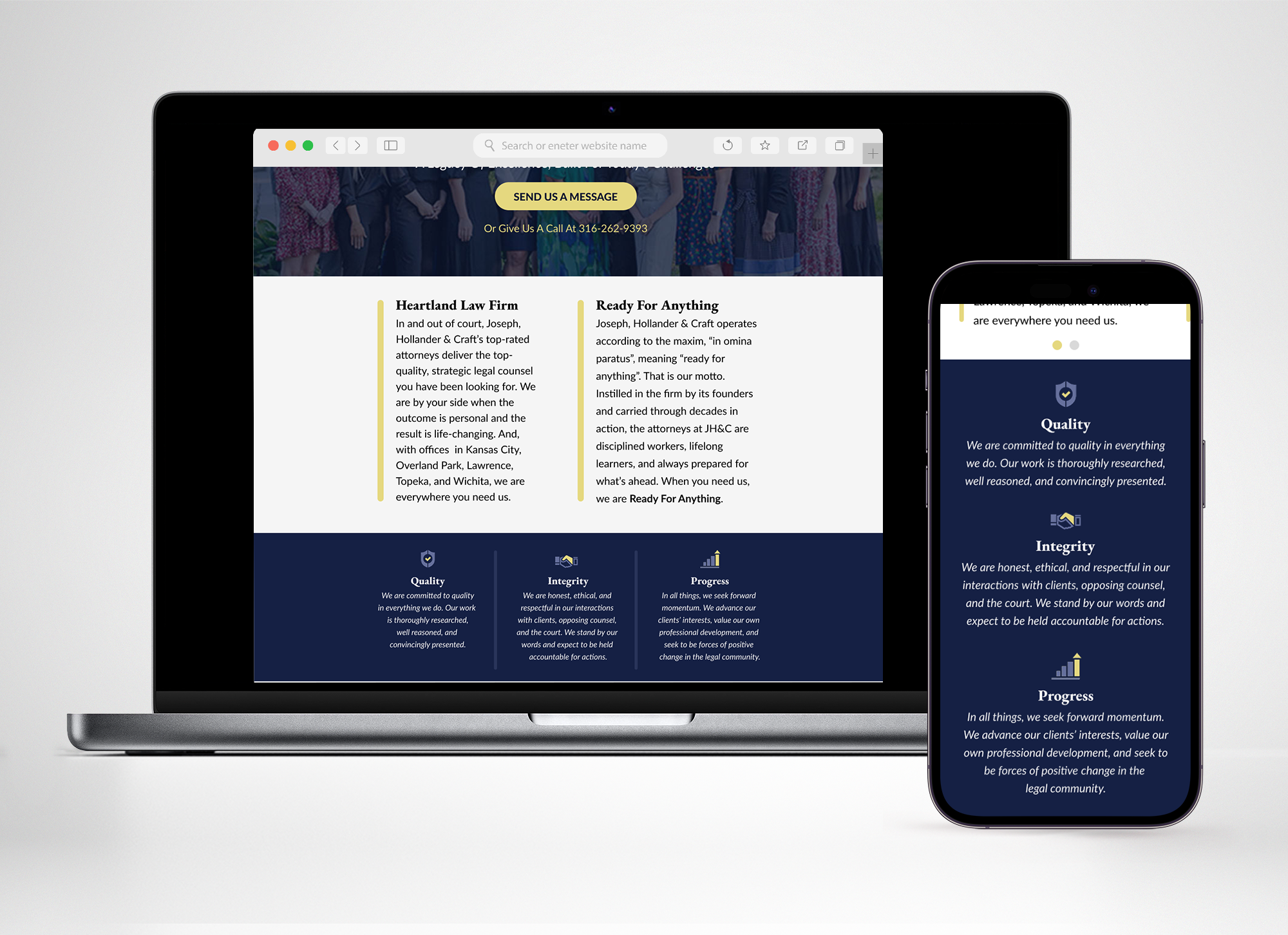
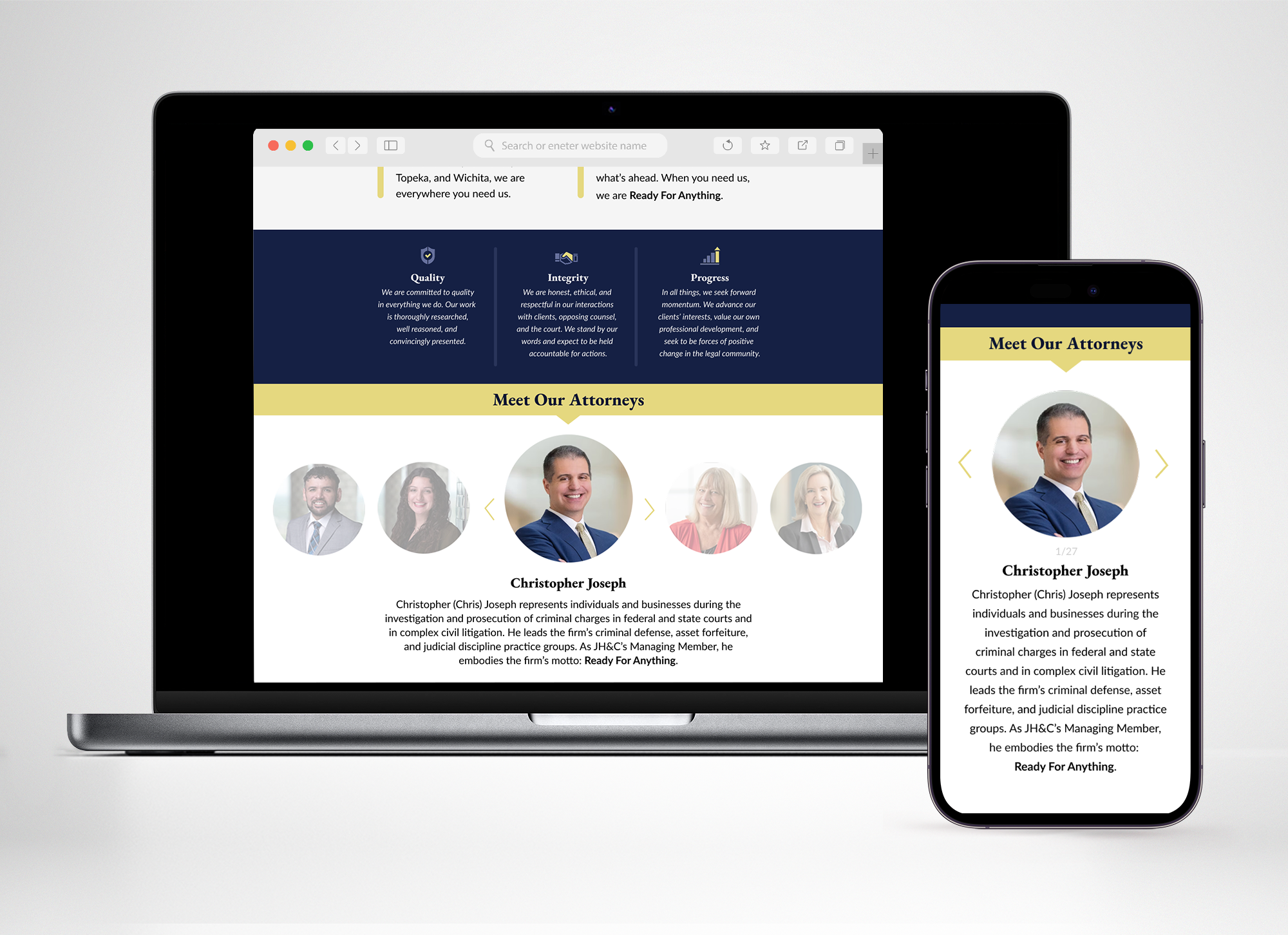
As a part of the design test, I was asked to re-design 1-2 blocks worth of site content to support the new brand identity. The main goal in mind was to have a call to action above the fold, ensuring if people wanted to contact the firm, they could do so in multiple ways, and quickly. The button would lead you to a form field where you can specify the type of assistance needed, while the number is readily available within the hero. The sections below clearly state what the firm stands for, solidifying company values, and introducing each lawyer with their specialties and personal flair. The color scheme was meant to illustrate professionalism, elegance, and approachability. The navy stands for reliability, while the lighter shades of creamy blue and yellow are meant to evoke feelings of accessibility and friendliness. Bold, serif primary typefaces are the foundation of the brand text, with a tried and true feel of historic dependability, while the sans serif secondary type promotes legibility and a modern, welcoming nature.
Original site (prior to the redesign) is available here for comparison purposes: https://josephhollander.com/
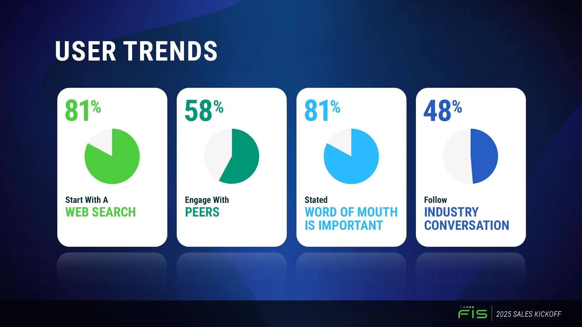
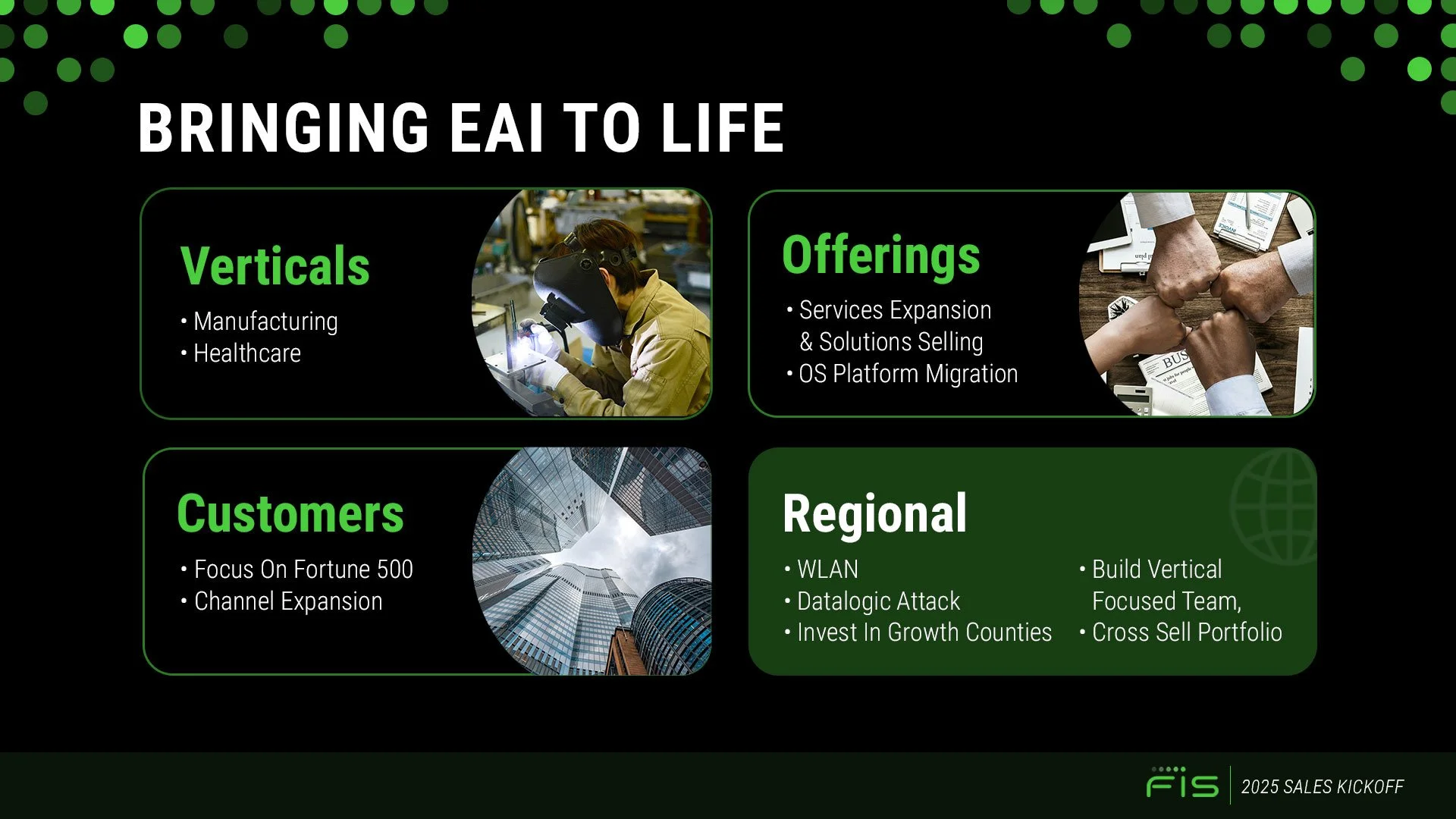
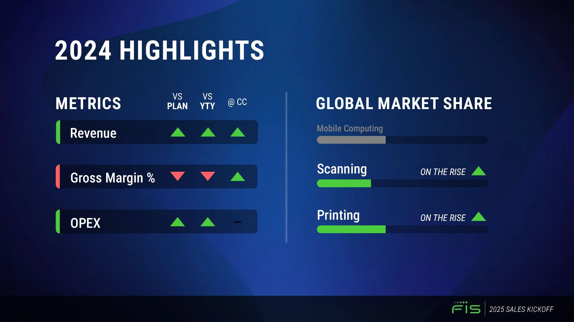
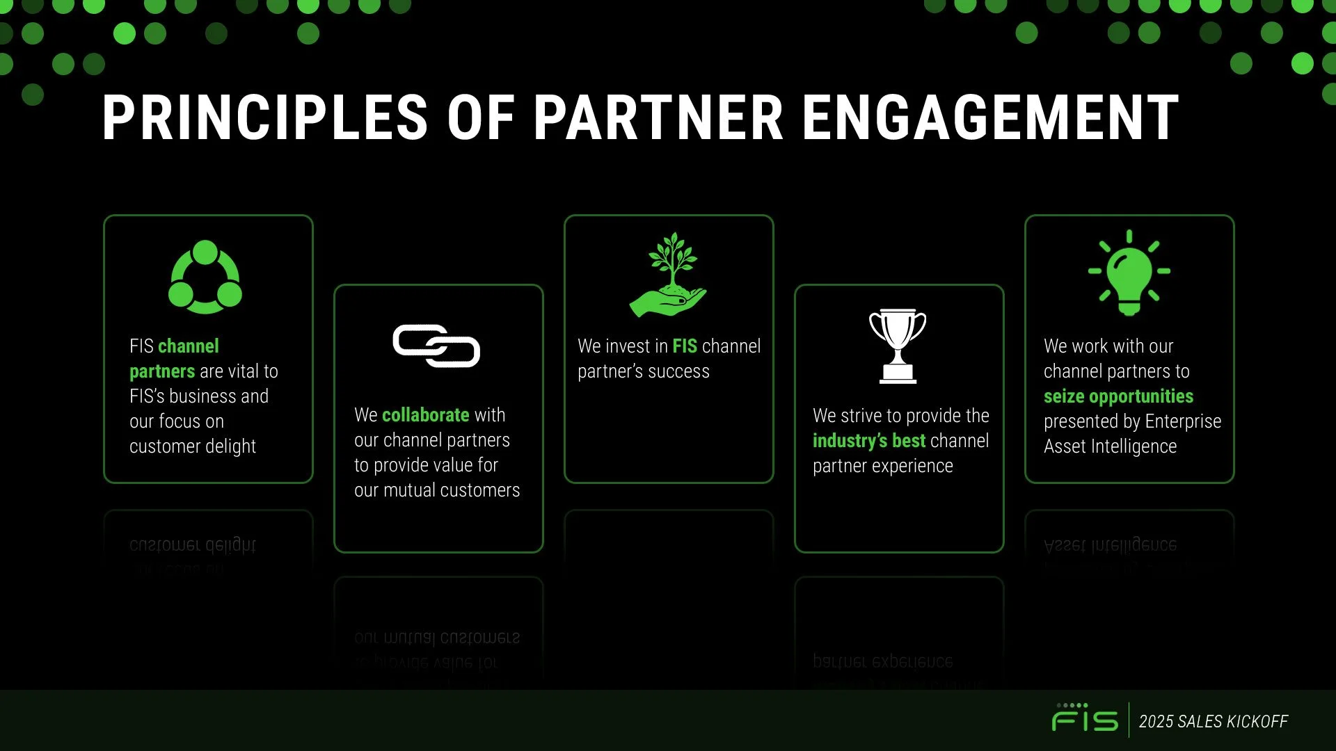
Presentation Design – FIS Sales Kickoff Meeting
As a part of a design test for ADM Creative group, I was tasked with creating a presentation based on complex data from a copy deck. I was encouraged to pull colors and textures from the company website, find my own photos to enforce key concepts, rework icons, and explore best practices for infographic-style representations of the provided content. These slides were designed in both Photoshop and natively in Powerpoint.
Original Site for reference material can be found here: https://www.fisglobal.com/
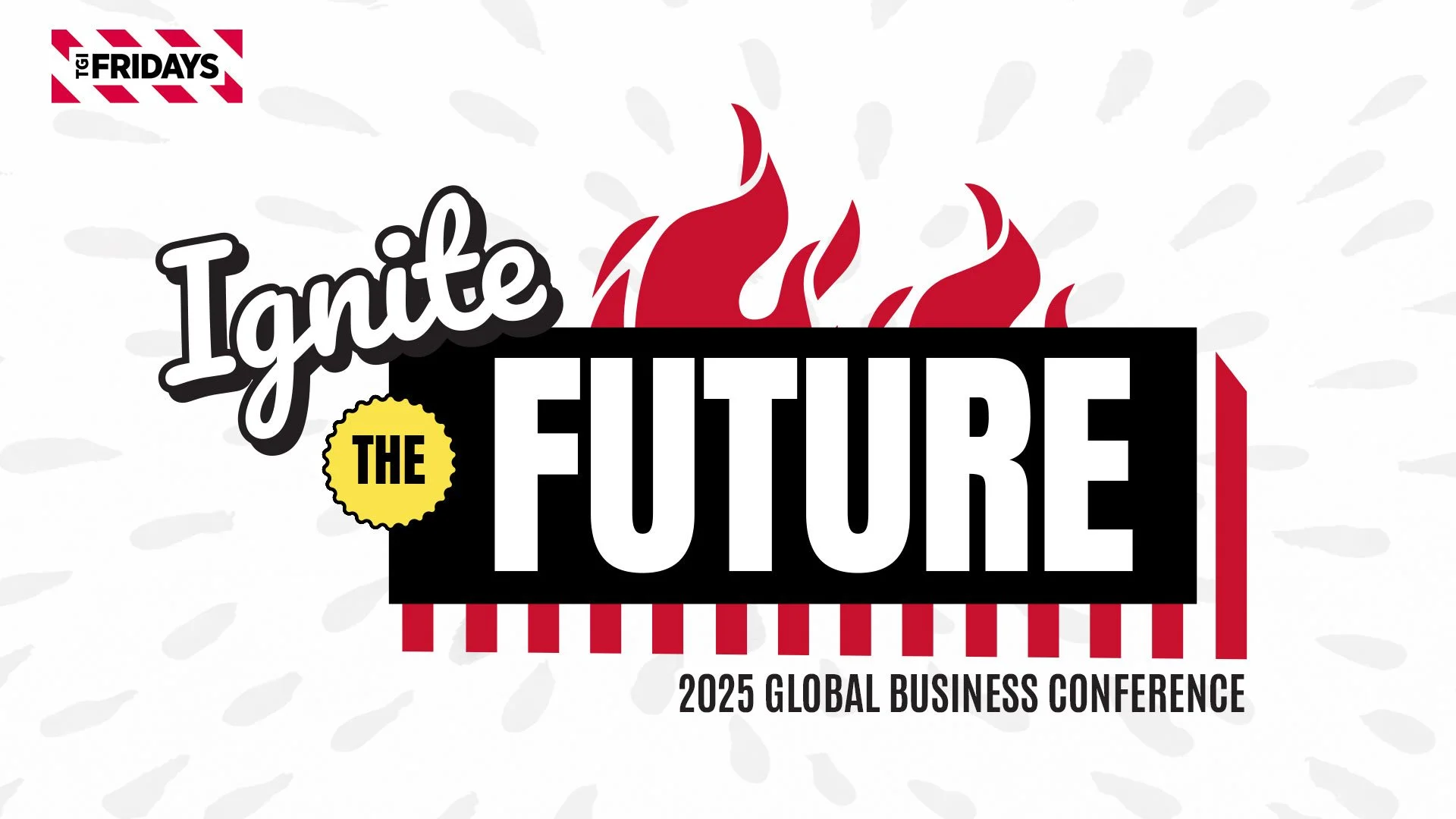
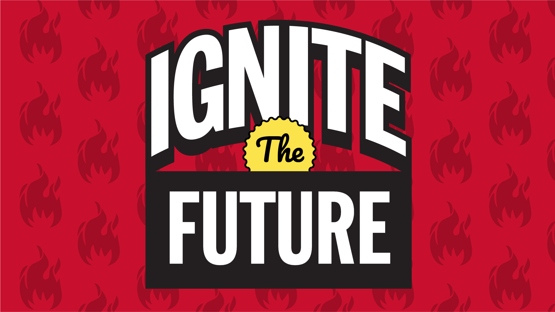
Event Branding & Screen Design
As a part of a design test for ADM Creative group, I was tasked with creating mock-branding assets for a live event hosted by TGI Fridays. I was encouraged to design the event typographic lockup and accompanying screen assets based on aesthetics from their menu, identity, and customer-facing elements across site and social. I was not supplied with any imagery, nor stock accounts, so all photography is pulled directly from TGI’s site. Leveraging the color palettes, container elements, adjacent typefaces, and historical information from company research, I was able to put together a few options for theme graphics and walk-in screens.
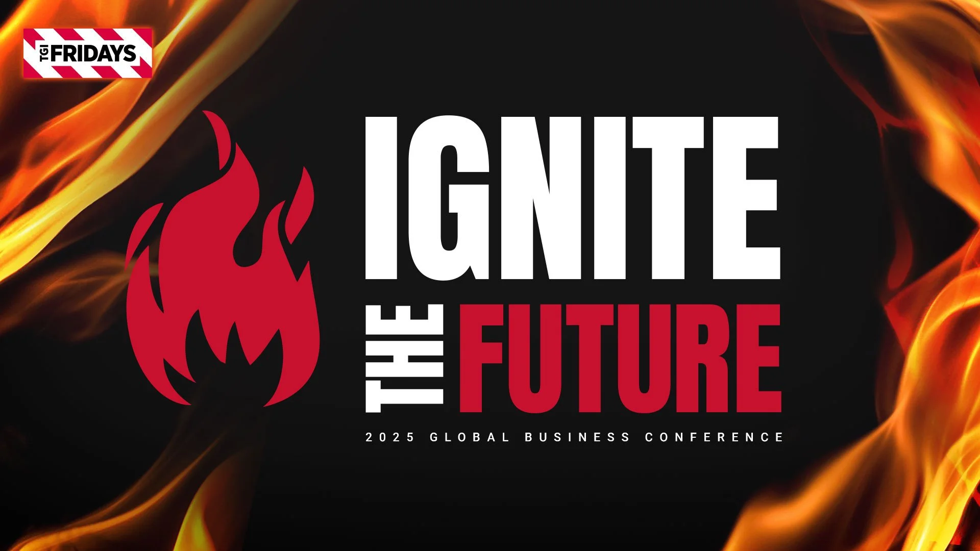
Main Logo Lockup
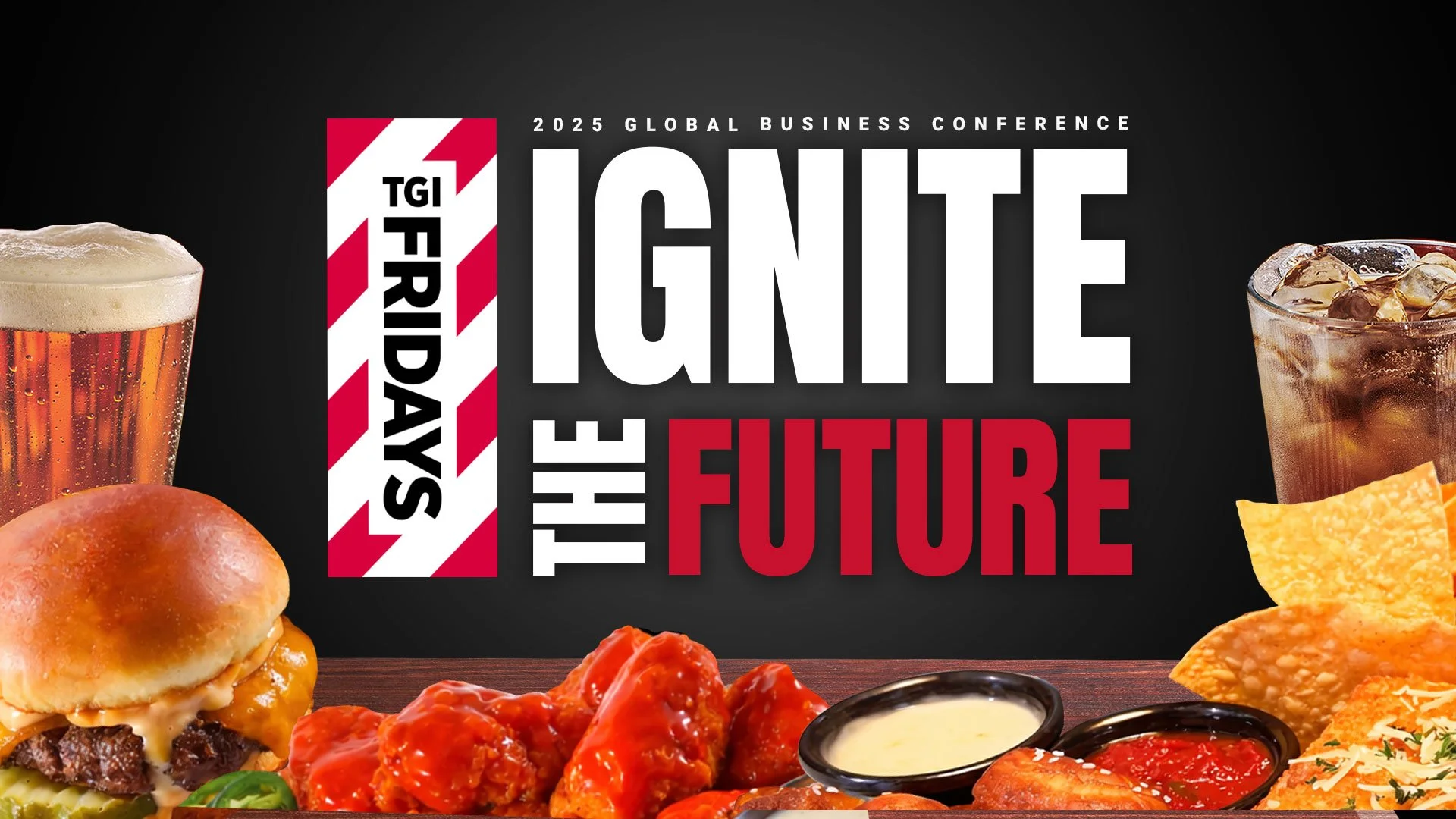
Alt to Main Logo Lockup
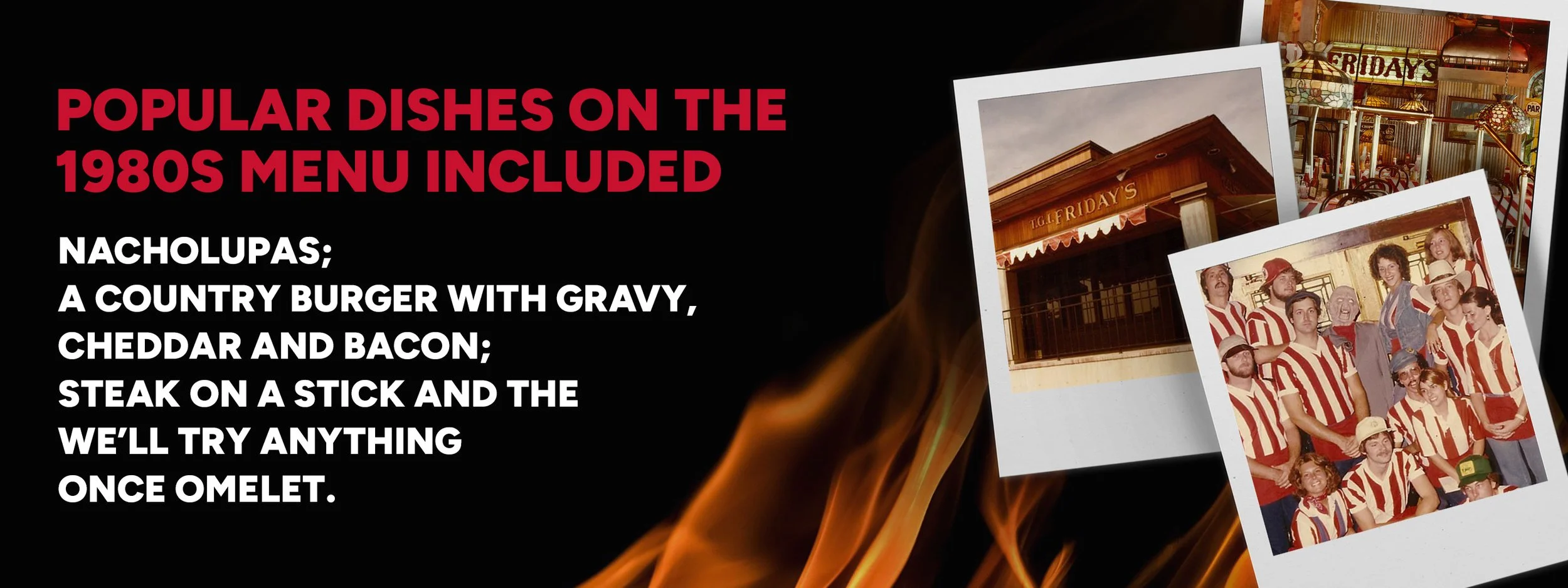
Fun Fact Screen 1
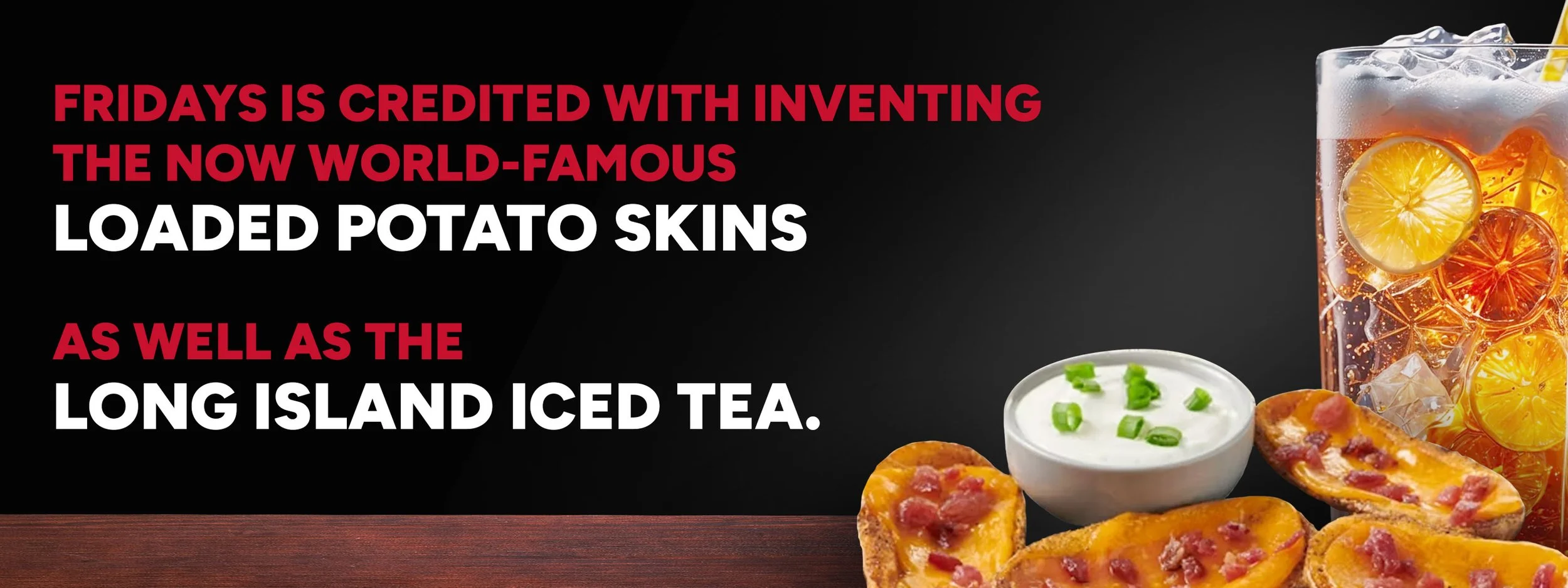
Fun Fact Screen 2
Alternate Logo Option
Stretch Logo Option
Newsday - Event Logo Options
As a part of a design test for Newsday, I was tasked with creating a new event logo for feedme’s top restaurants of Long Island. I was instructed to remain true to the brand’s red and black color palette while incorporating iconography associated with food and restaurants. I took inspiration from their instagram page to inform my decisions regarding container elements and typographic treatments/styling.
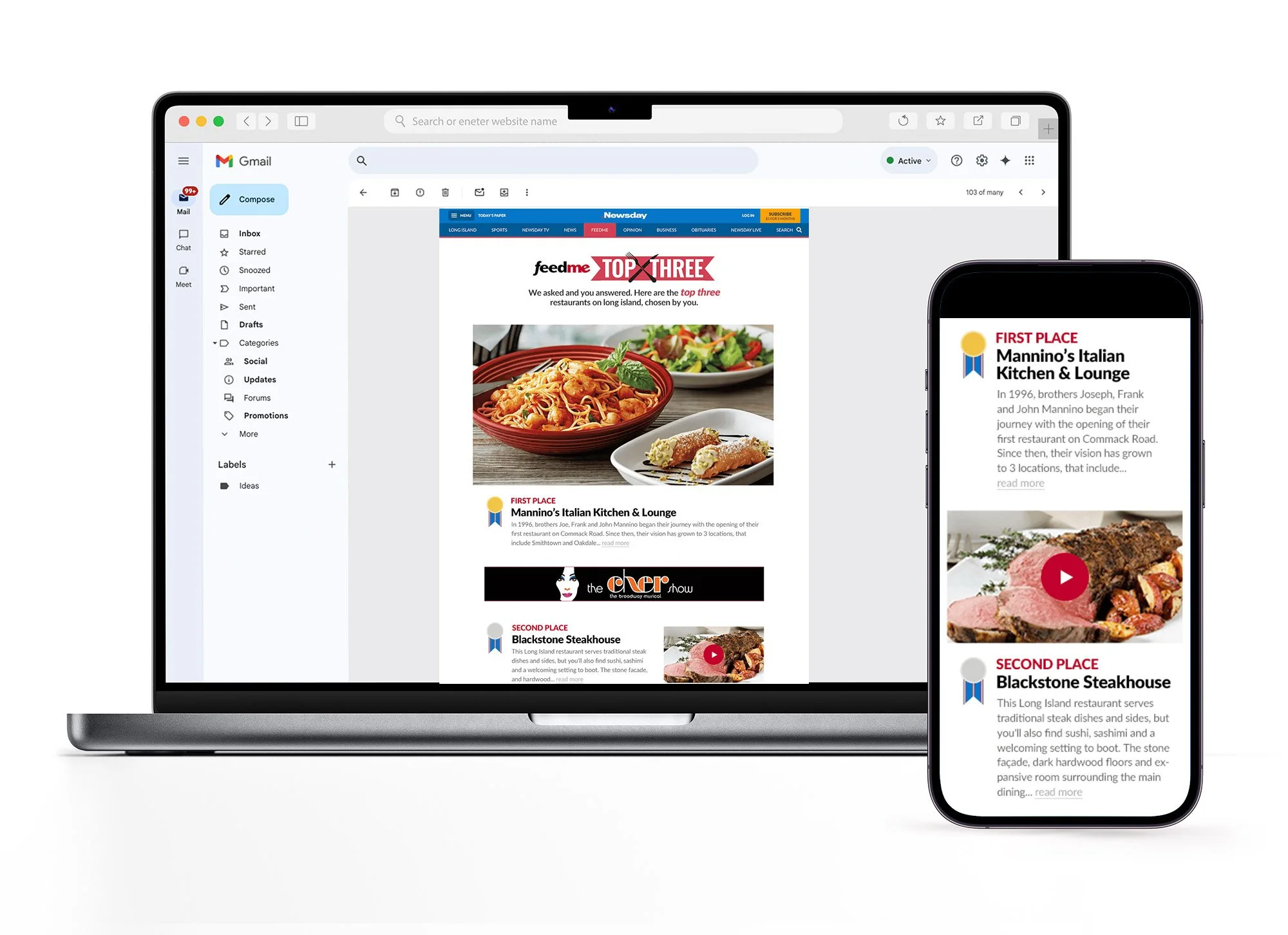
Newsday - Landing Page
After finalizing the logo design, I created a simple landing page to support the event. Consistency was key: margins, font sizes, line heights, padding, and ad placement were carefully aligned with other on-site Newsday initiatives. By keeping the design minimal and focused, it ensured users could easily engage with the content.