Publishers Clearing House
Transformation - Emails
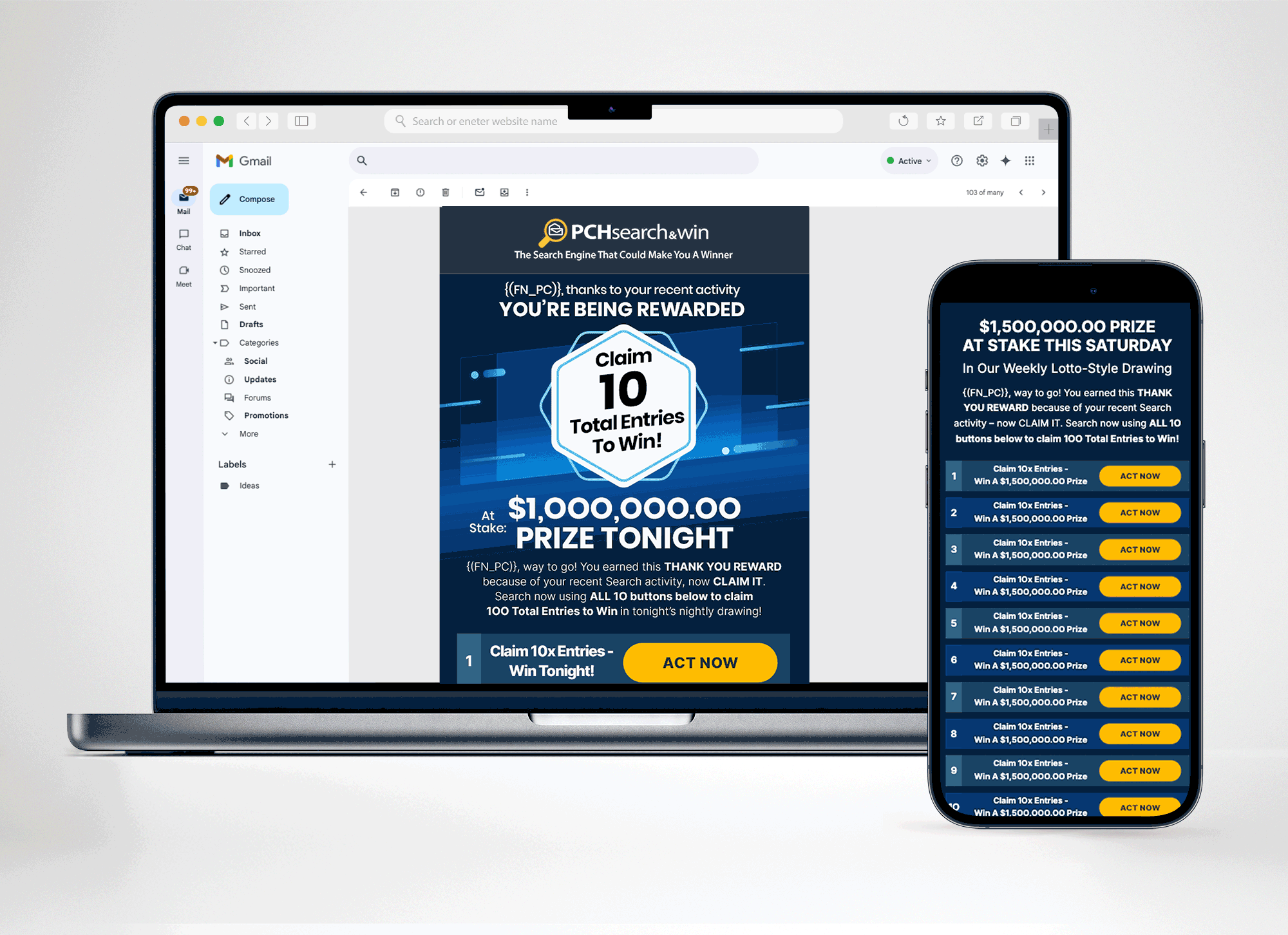
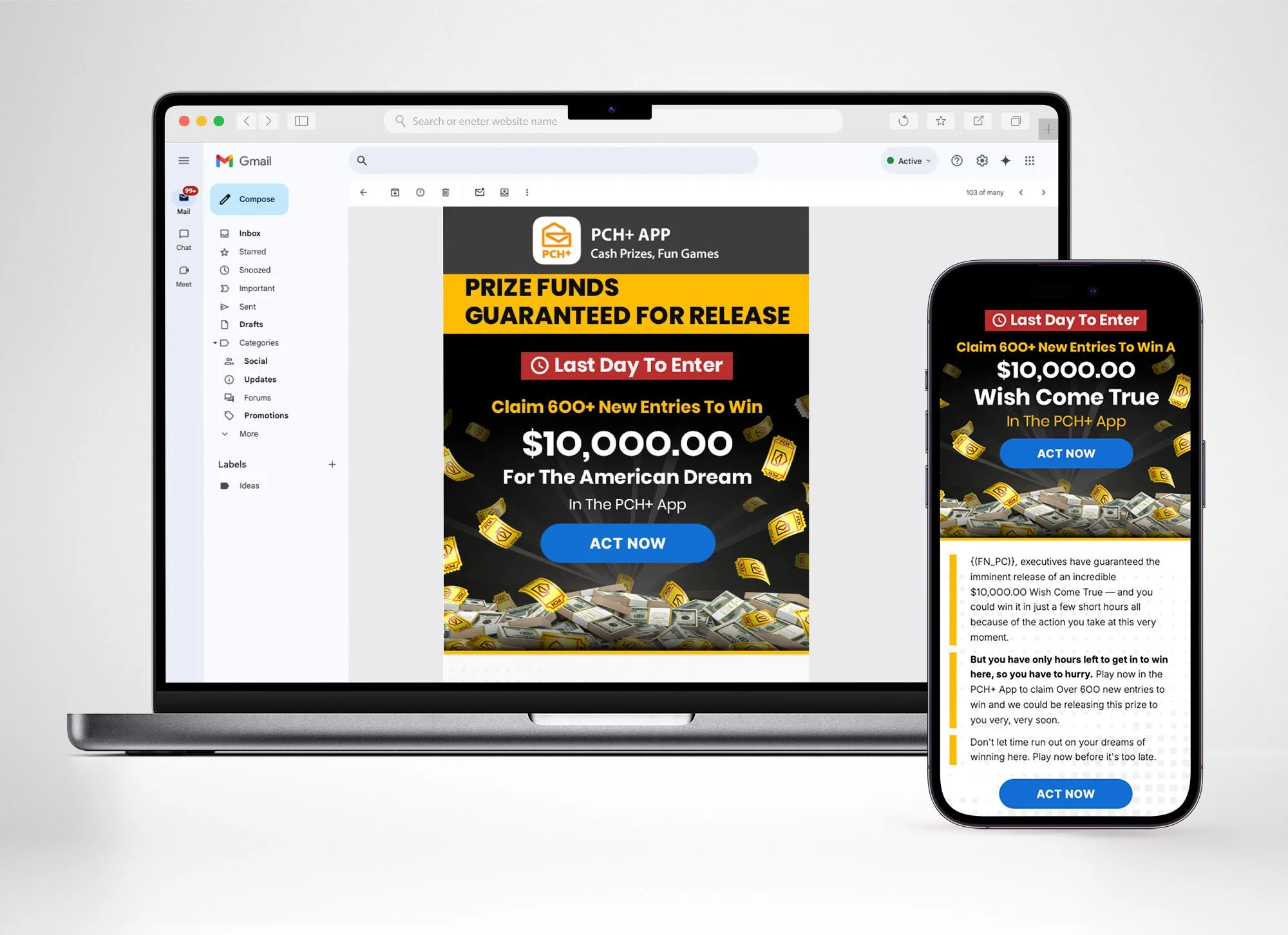
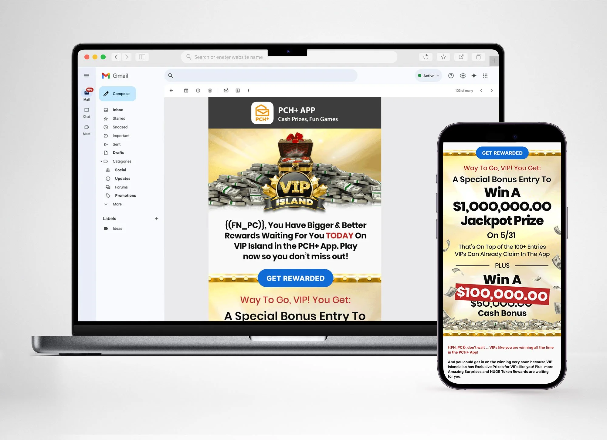
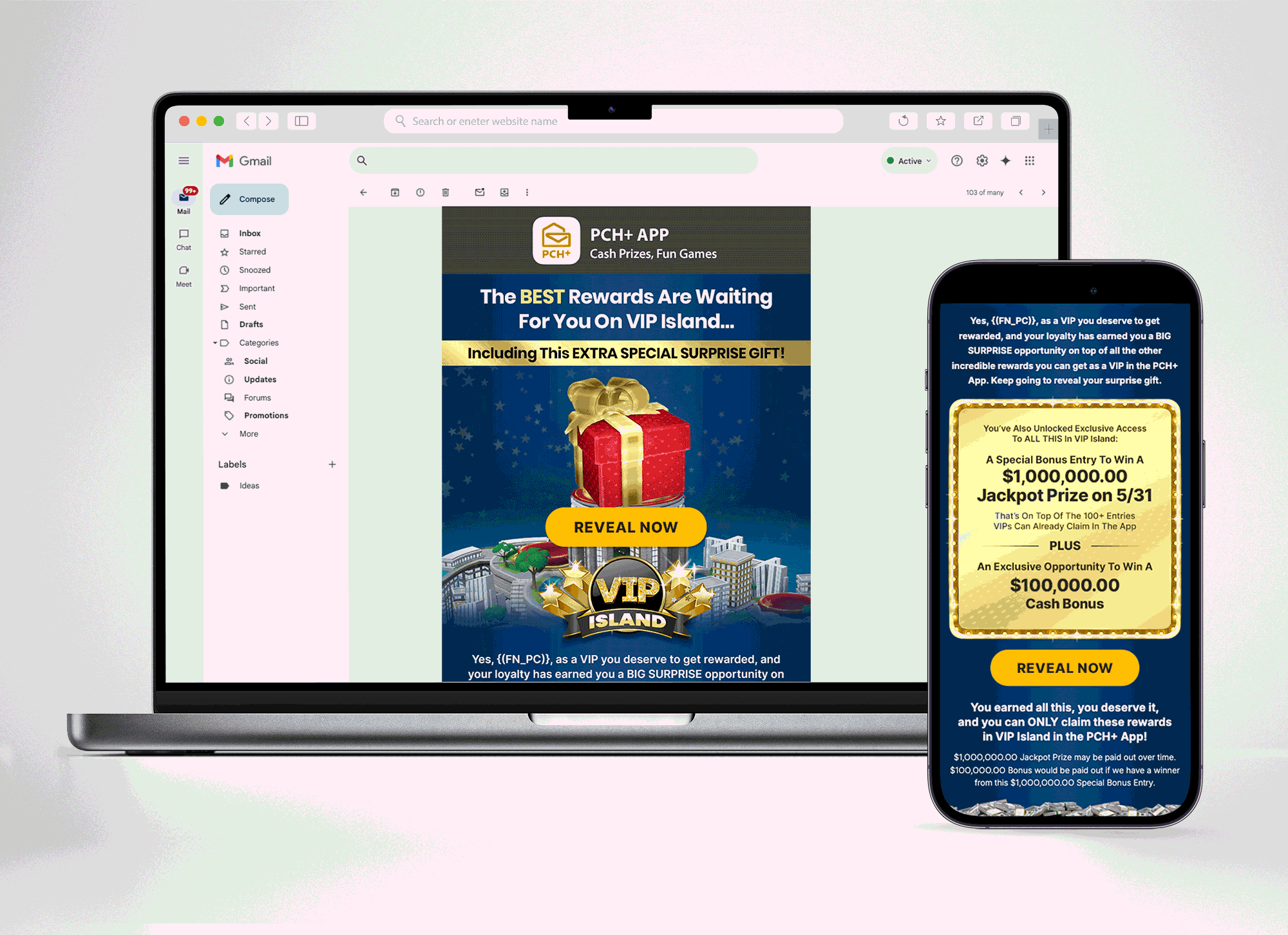
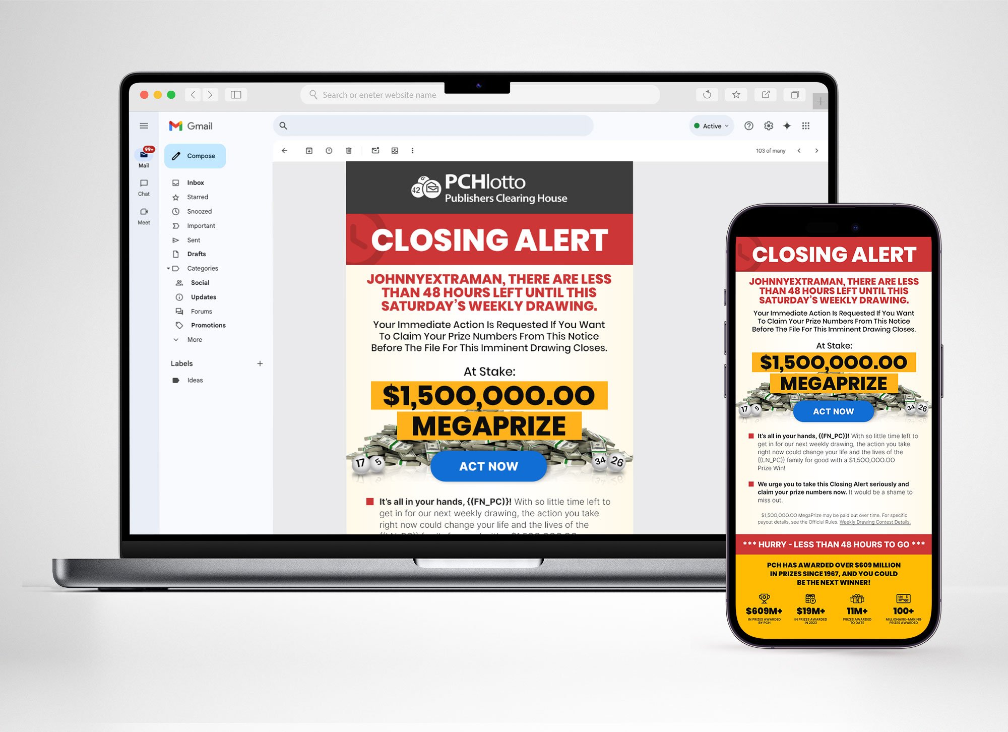
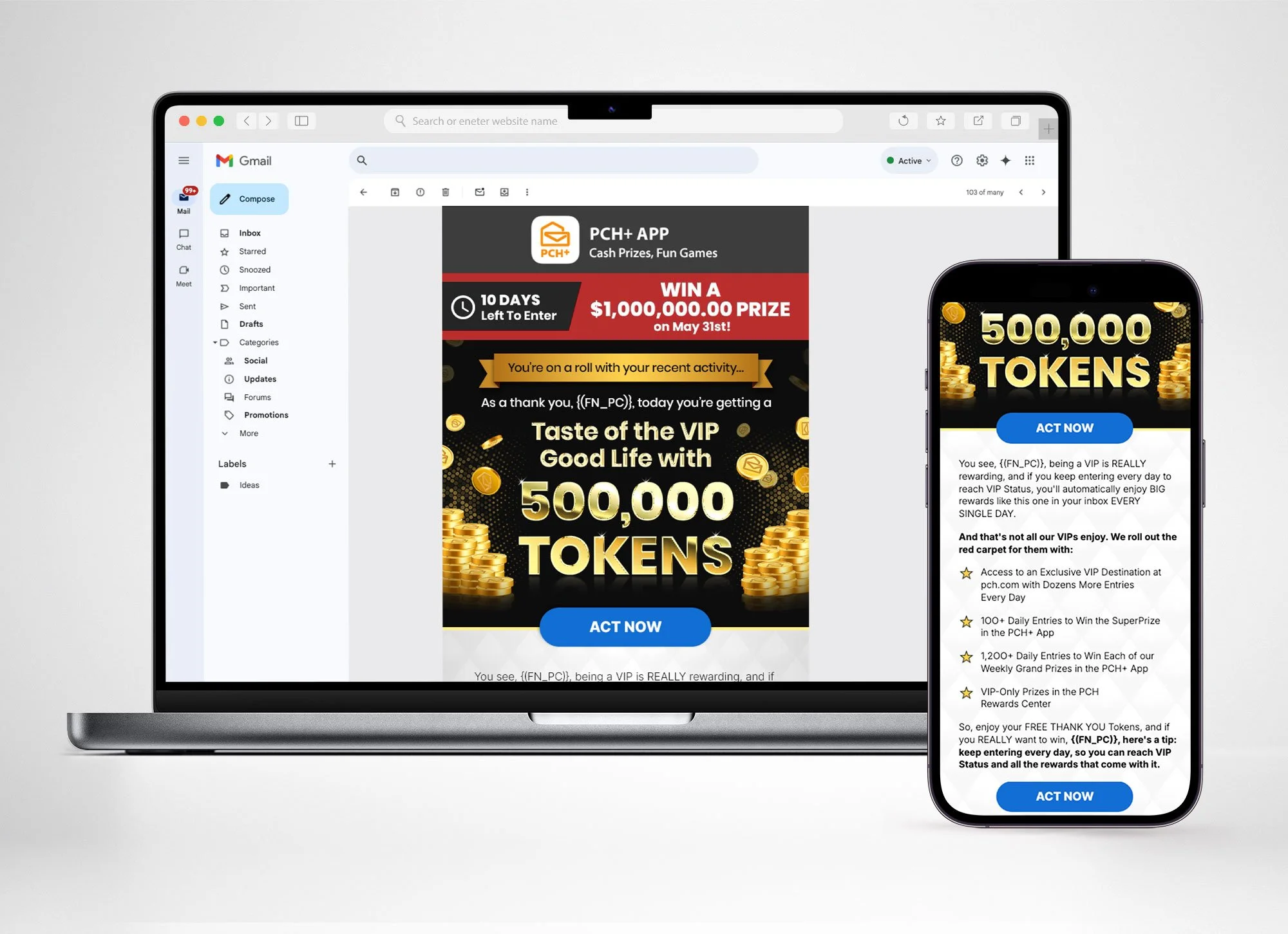
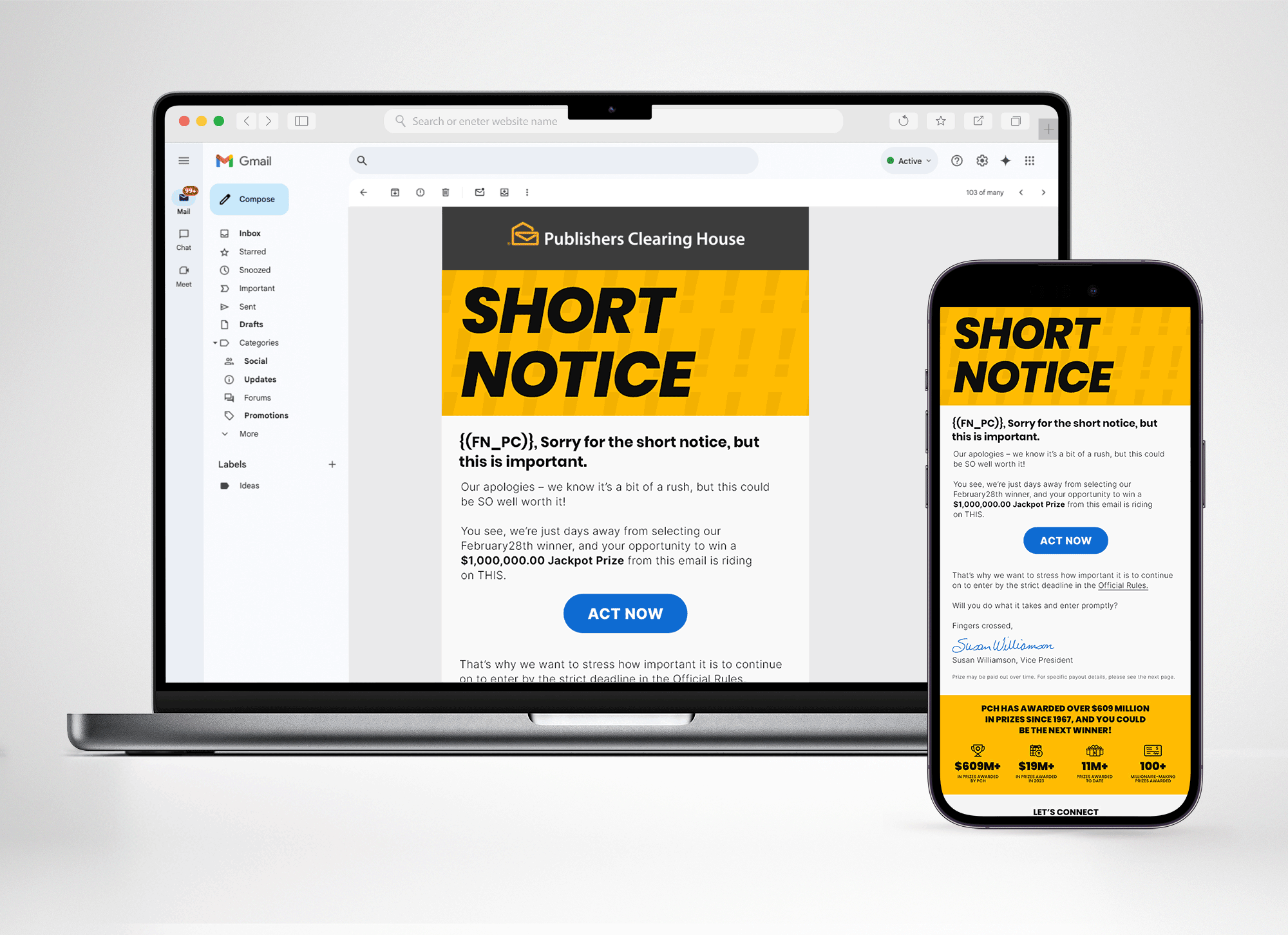
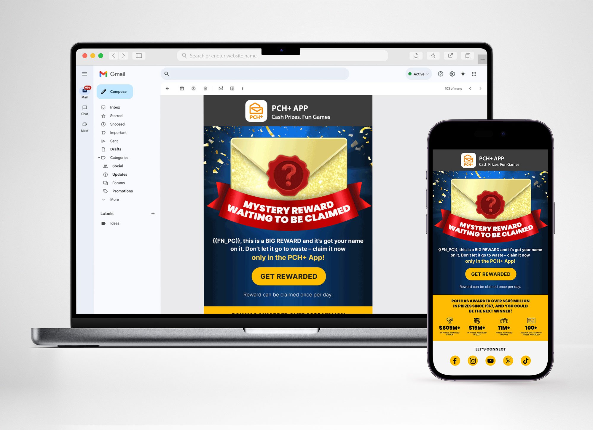
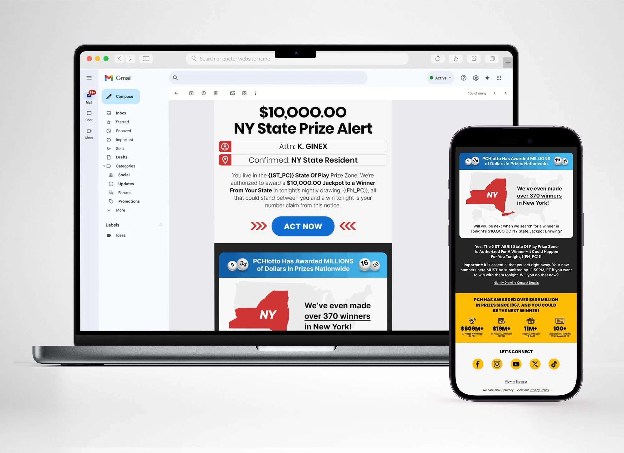
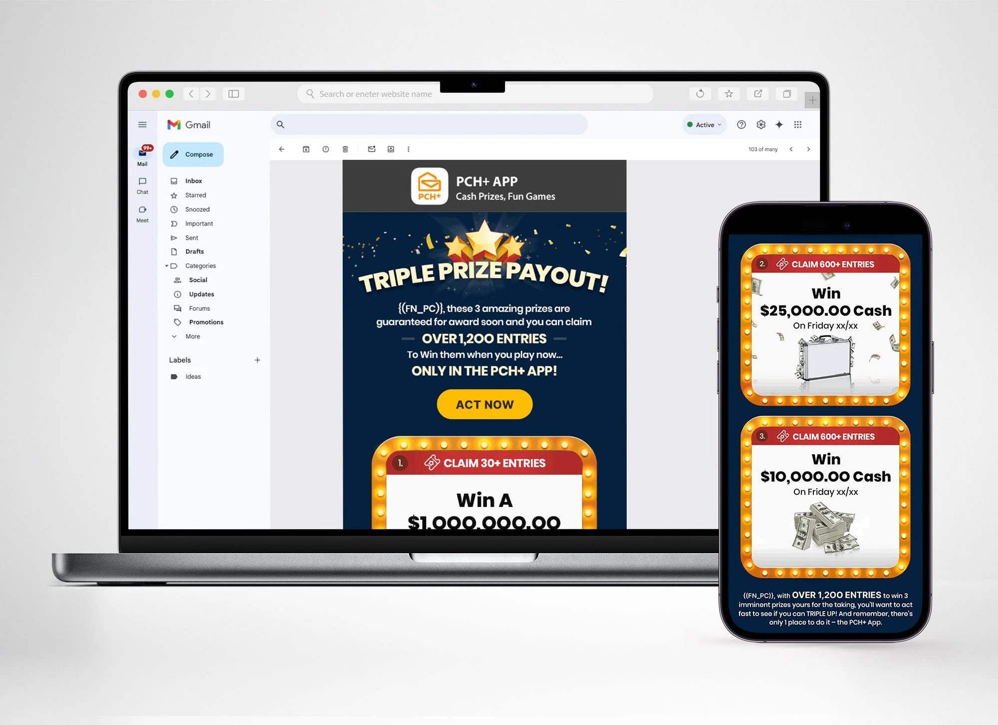
This initiative was a company-wide effort to bring consistency, professionalism, and impact to all customer-facing touch points. Before the project, PCH lacked a unified style guide, resulting in emails that ranged wildly in tone — from overly promotional to overly formal and official. I helped enforce a cohesive design system to emails that ensured unified branding for all mailings, consistent, audience-focused messaging with a more personal voice, and modern layouts that improved readability. The system was flexible enough to allow each business property to retain its own identity and micro-characteristics, to prevent blurring, while maintaining overall cohesion. This transformation significantly boosted performance, leading to higher click-through rates and double-digit ROI growth. (Coded html files are available upon request)


Transformation - Website Assets
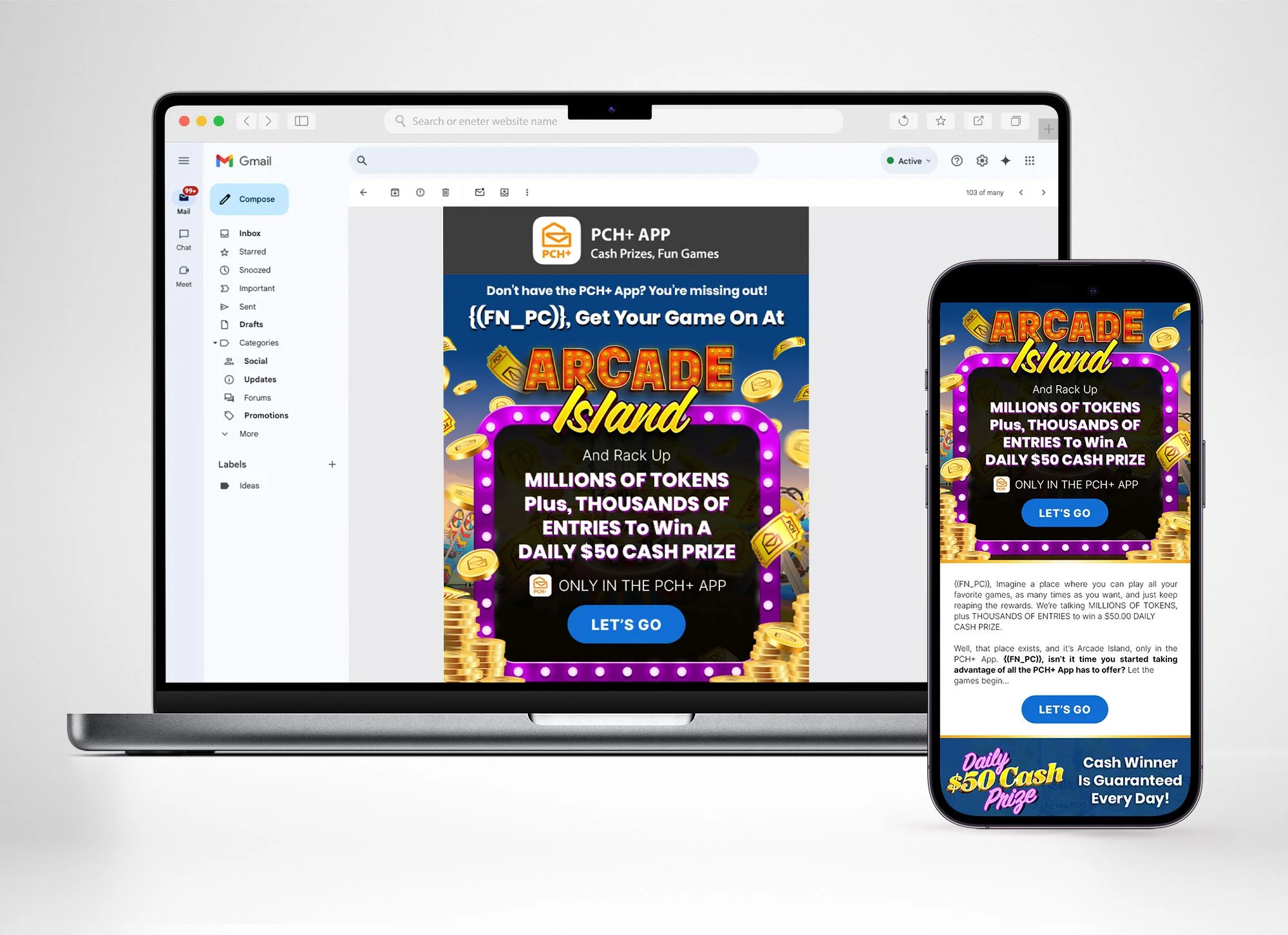
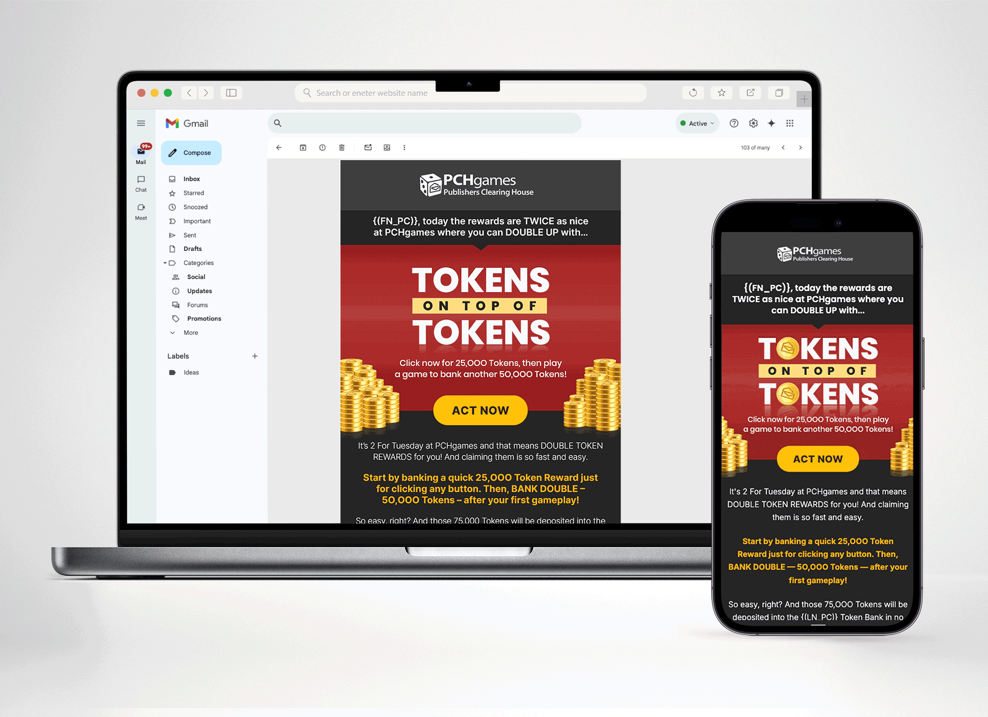
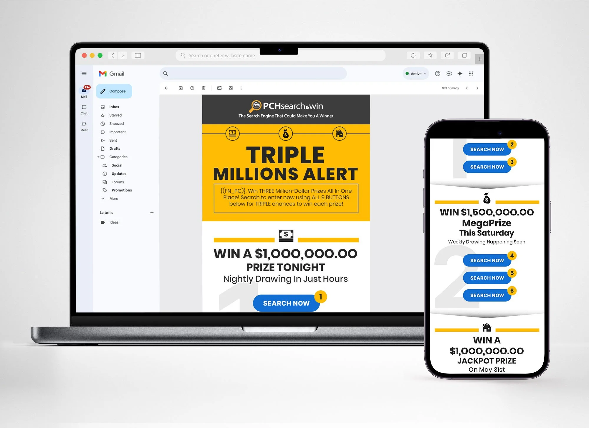
The transformation extended beyond email into post-click ad units and site assets, ensuring a seamless brand experience across channels. These elements were redesigned to reflect the updated visual language and messaging introduced in the email program. Special focus was placed on loyalty users, the company’s most engaged audience segment. We developed unique token-based offers tied directly to ad units, rewarding loyalty tiers with bonus tokens while simultaneously driving advertiser revenue. This strategy not only strengthened user engagement, but also delivered consistent, incremental week-over-week ROI growth.
Gamification played a key role in boosting user engagement as well. Inspired by the popularity of interactive content from platforms like BuzzFeed, we introduced daily quizzes that rewarded users with entries to win real prizes or tokens redeemable for real rewards. To maximize participation, promotions ran daily through email banners and on-site placements, keeping the program highly visible and accessible. This approach significantly increased quiz play time, and because quizzes were tied to ad revenue, the initiative performed favorably week after week.


Event Logos

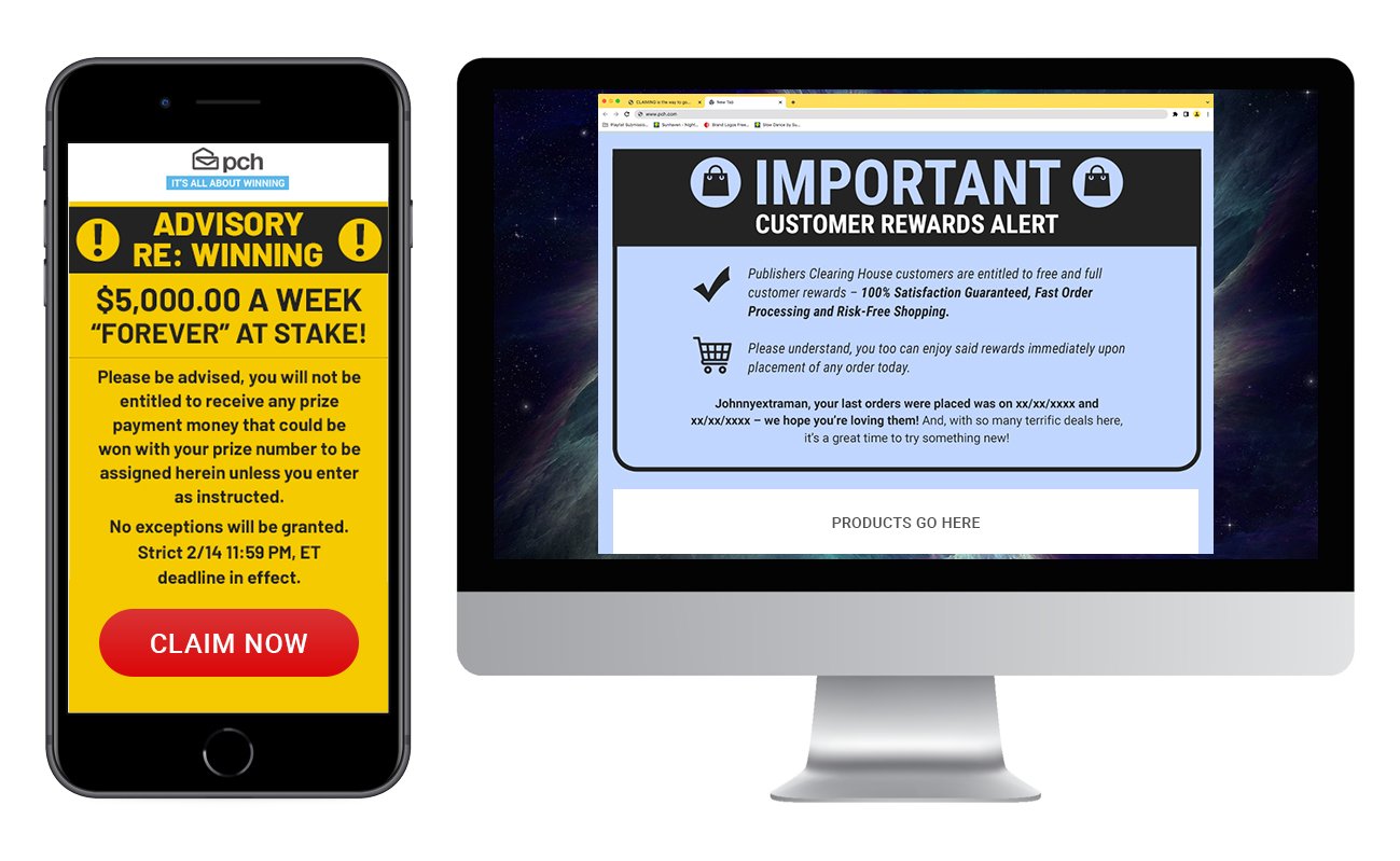
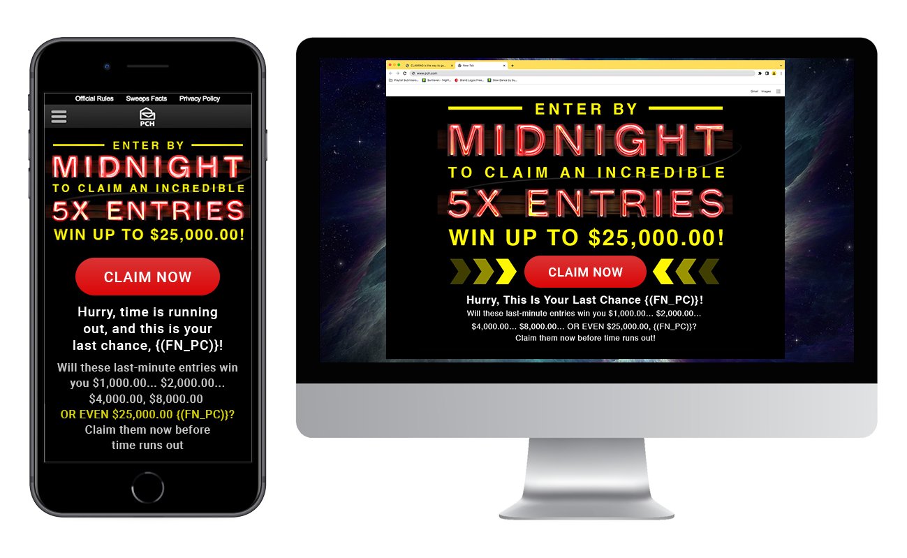
Classic - Emails
Before the transformation project, PCH’s email strategy reflected the needs and preferences of its long-standing audience. Founded in 1953, the company’s core demographic skewed toward (now) retiree-aged individuals who responded strongly to copy-heavy layouts, dense promotional messaging, and flashy multi-layered animations. While there was little visual or tonal cohesion across campaigns, this eclectic style actually drove engagement by keeping users curious and eager to return. At the time, this approach aligned perfectly with the expectations of the audience and contributed to consistently high click-through rates.


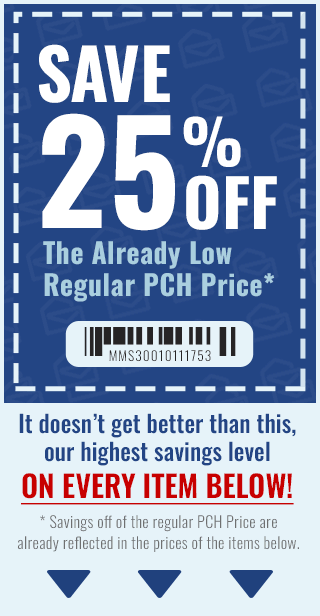
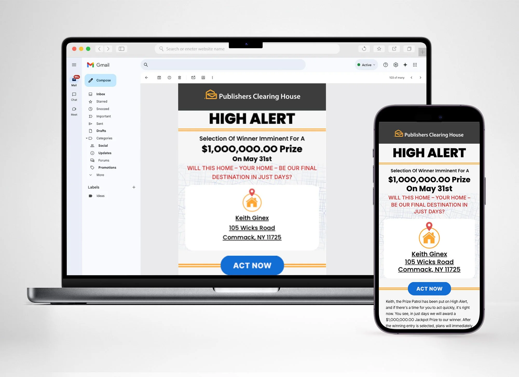
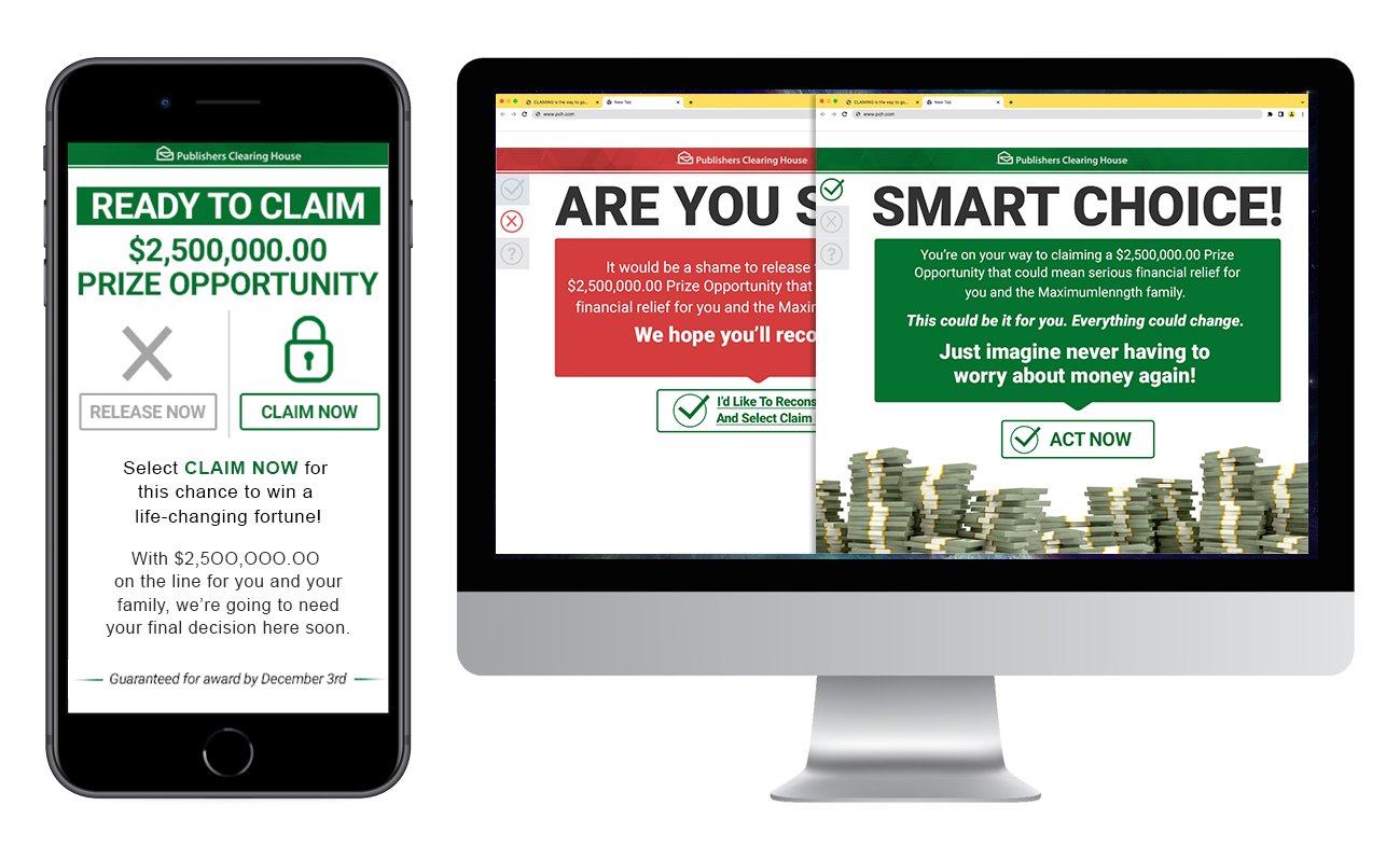
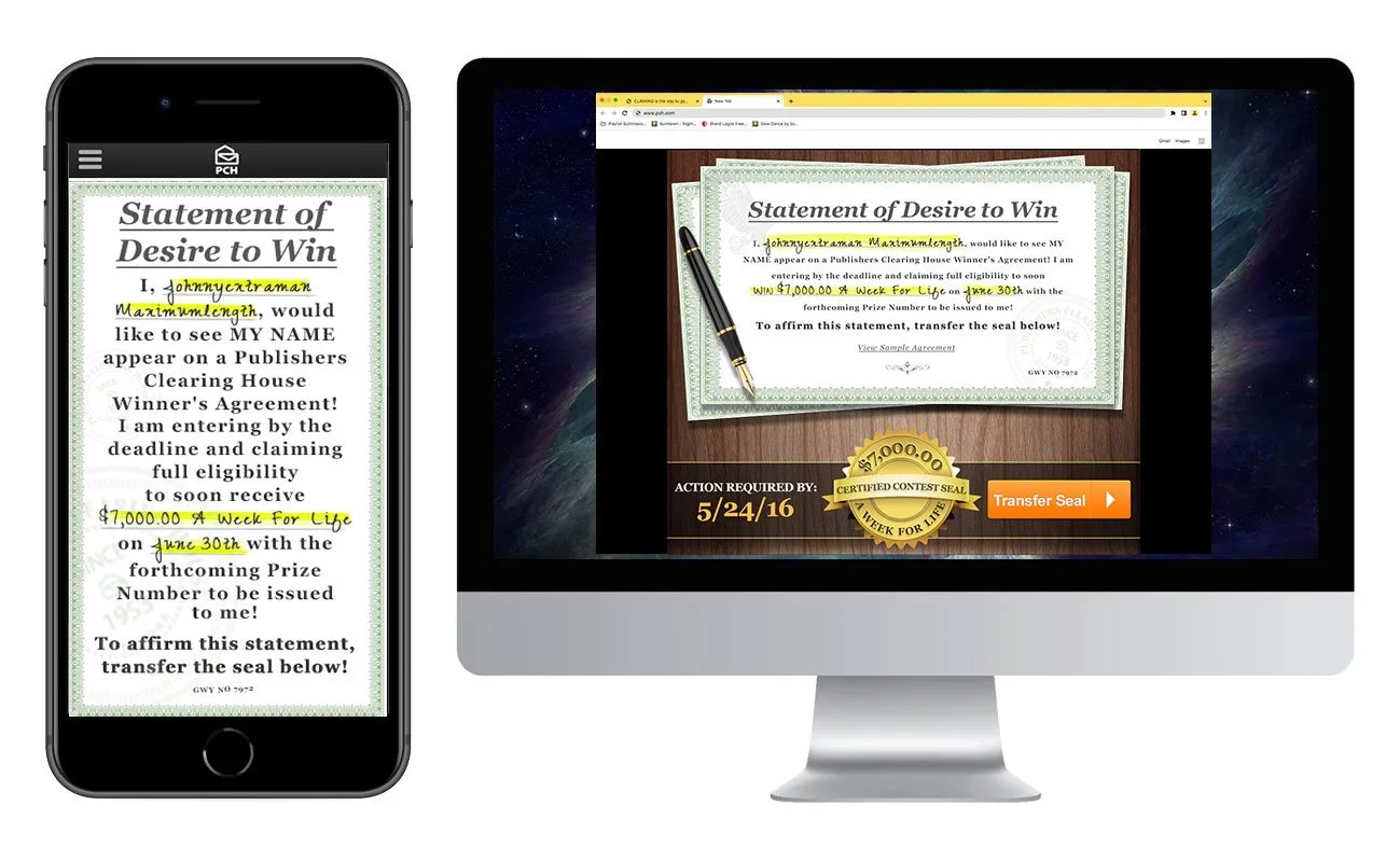
Classic - Landing Pages
Much like the classic emails, the landing pages showcased a wide range of design styles. Some hinted at modern approaches with flat icons and countdown clocks, while others drew on PCH’s print-era roots by featuring certificates, faux credit cards, and other physically tangible visual cues. The iconic Prize Patrol was a frequent centerpiece, serving as a trusted engagement driver that reinforced the excitement of “winning big” and helped strengthen the user’s emotional connection to the brand. Between the email’s high click through rates, and the product lineups attached to the landing pages, PCH was able to bolster an impressive $800,000,000.00 just before the pandemic changed the landscape of the business.


Classic - Site Assets
Site assets relied heavily on flashy animations to capture attention and break through the clutter of visually and typographically dense pages. Motion graphics became a core design strategy, ensuring that key messages stood out. Inspiration came from a wide range of sources — from live performances and scratch-off tickets to supermarket price guns and even construction sites. This open approach kept the creative fresh, surprising, and engaging for the majorly older demographic of users.